# load packages
library(tidyverse)
library(here)
library(countdown)

# set theme for ggplot2
ggplot2::theme_set(ggplot2::theme_minimal(base_size = 14))

# set width of code output
options(width = 65)

# set figure parameters for knitr
knitr::opts_chunk$set(
  fig.width = 7,        # 7" width
  fig.asp = 0.618,      # the golden ratio
  fig.retina = 3,       # dpi multiplier for displaying HTML output on retina
  fig.align = "center", # center align figures
  dpi = 300             # higher dpi, sharper image
)Deep dive into ggplot2 layers - I
Lecture 1
University of Arizona
INFO 526 - Spring 2024
Warm up
Announcements
- A note on readings for this week: some of it is review so feel free to skim those parts.
- RQ 1 is due Friday (Jan 26)
Setup
A/B testing
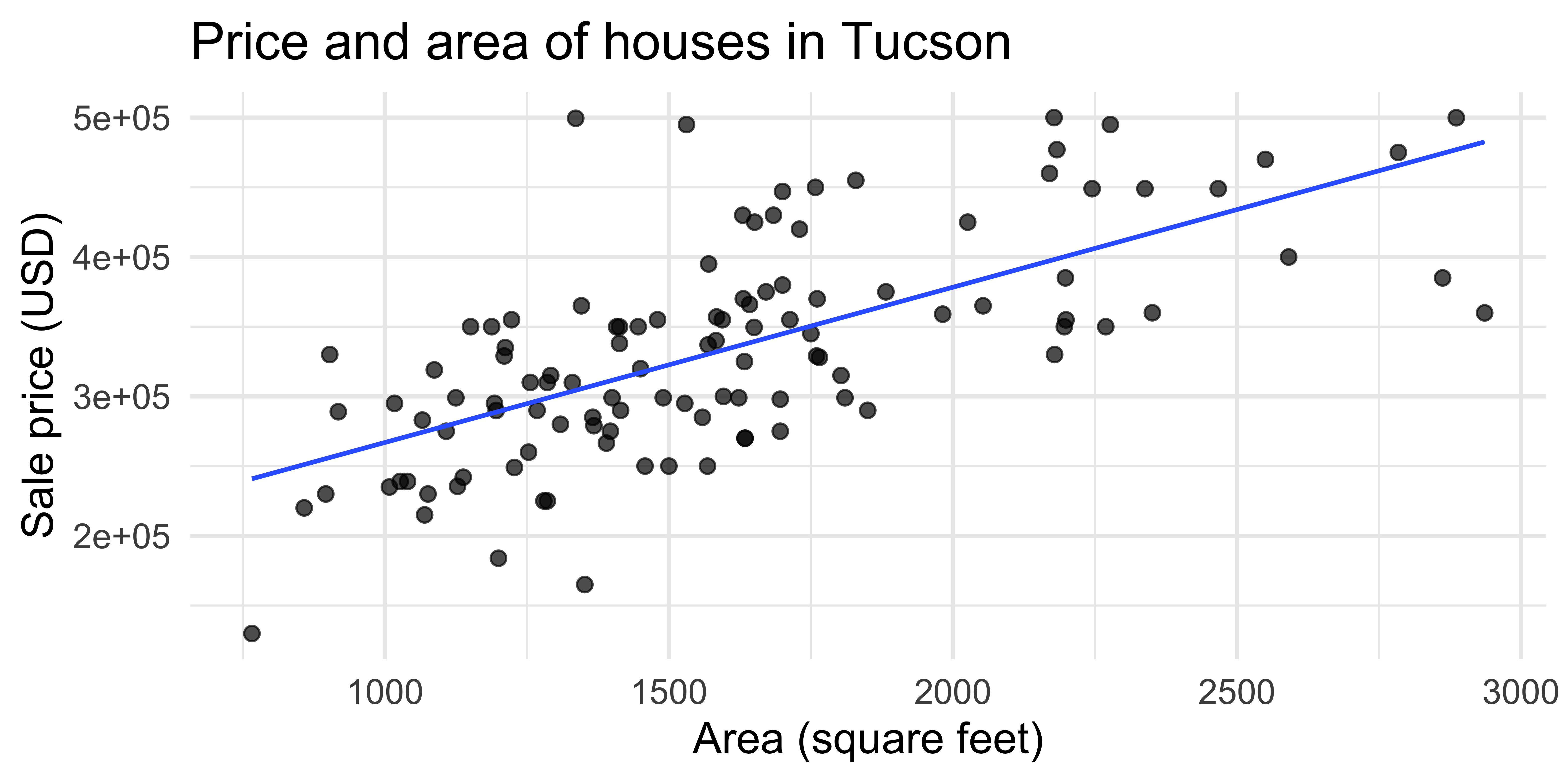
Data: Sale prices of houses in Tucson
Data on houses for sale
in Tucson, AZ, around July 2023Scraped from Zillow
Source:
tucsonHousing.csv
slides/data/tucsonHousing.csv
library(tidyverse)
library(here)

tucsonHousing <- read_csv(here(
  "slides", "01", "data" ,"tucsonHousing.csv"))

glimpse(tucsonHousing)
Rows: 112
Columns: 8
$ address <chr> "710 E 5th St, Tucson, AZ 85719", "3543 N Fl…
$ year_built <dbl> 1936, 1943, 1948, 1950, 1950, 1951, 1951, 19…
$ price <dbl> 330000, 260000, 310000, 270000, 270000, 2149…
$ bed <dbl> 2, 2, 3, 4, 4, 3, 1, 4, 3, 3, 4, 4, 3, 3, 4,…
$ bath <dbl> 1, 1, 1, 2, 2, 1, 1, 2, 1, 2, 2, 2, 1, 2, 2,…
$ area <dbl> 903, 1253, 1256, 1634, 1634, 1070, 766, 1490…
$ type <chr> "Single Family", "Single Family", "Single Fa…
$ url <chr> "/homedetails/710-E-5th-St-Tucson-AZ-85719/8…A simple visualization
New variable: decade_built
tucsonHousing <- tucsonHousing |>
  mutate(decade_built = (year_built %/% 10) * 10)

tucsonHousing |>
  select(year_built, decade_built)
# A tibble: 112 × 2
year_built decade_built
<dbl> <dbl>
1 1936 1930
2 1943 1940
3 1948 1940
4 1950 1950
5 1950 1950
6 1951 1950
7 1951 1950
8 1952 1950
9 1952 1950
10 1952 1950
# ℹ 102 more rowsNew variable: decade_built_cat
tucsonHousing <- tucsonHousing |>
  mutate(
    decade_built_cat = case_when(
      decade_built <= 1950 ~ "1950 or before",
      decade_built >= 2000 ~ "2000 or after",
      TRUE ~ as.character(decade_built)
    )
  )

tucsonHousing |>
  count(decade_built_cat)
# A tibble: 6 × 2
decade_built_cat n
<chr> <int>
1 1950 or before 25
2 1960 9
3 1970 18
4 1980 9
5 1990 20
6 2000 or after 31A slightly more complex visualization
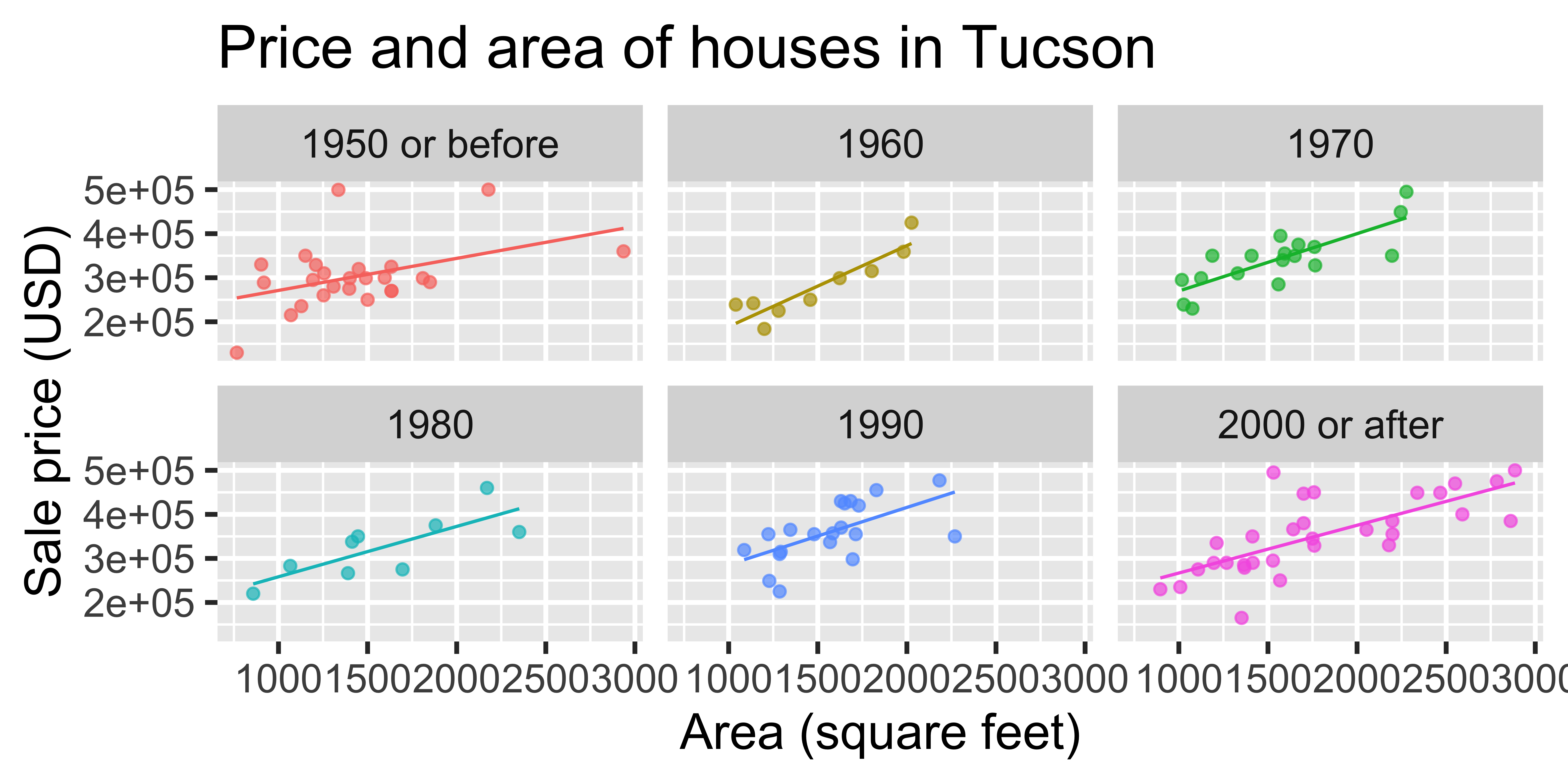
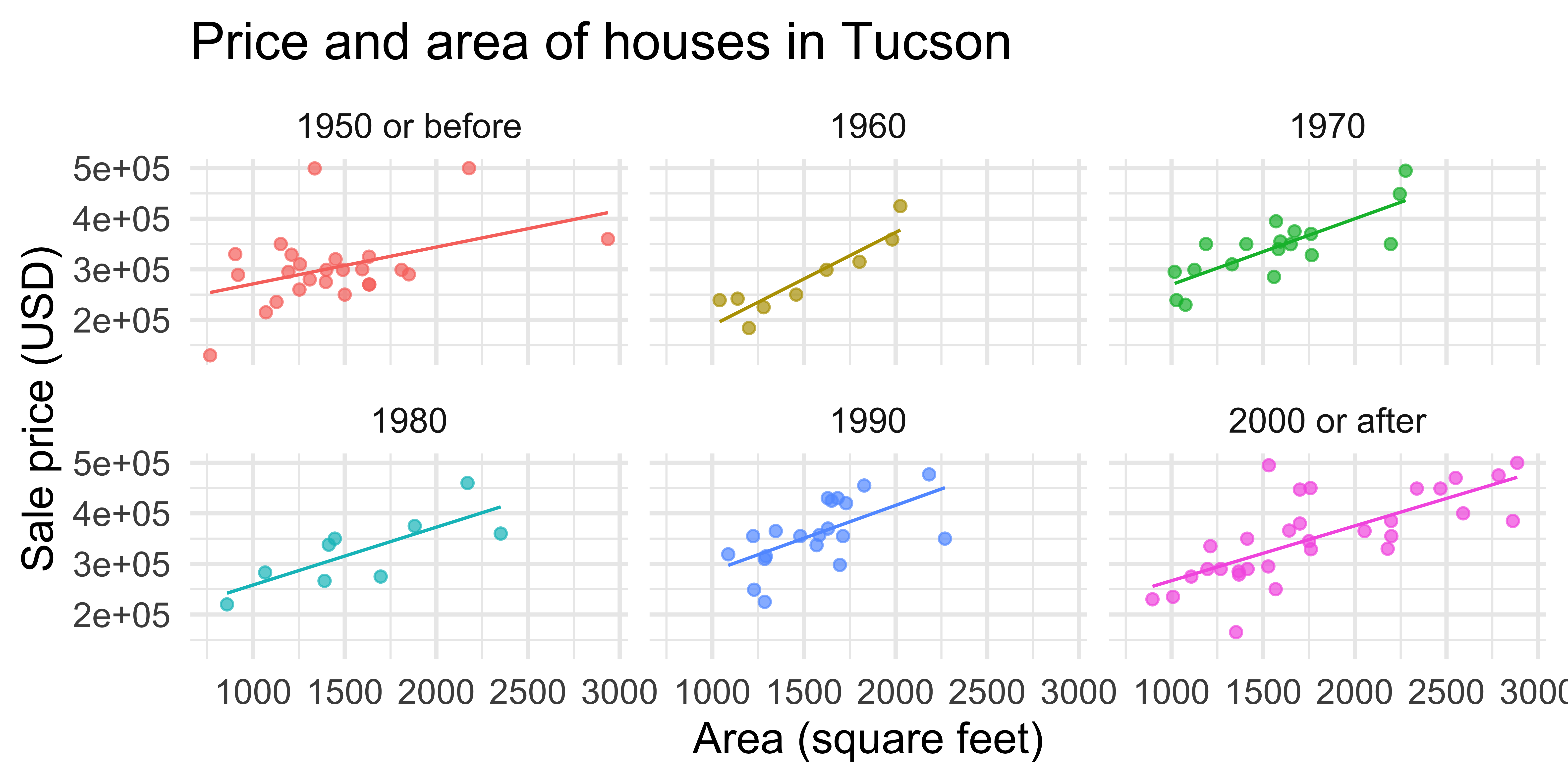
ggplot(
  tucsonHousing,
  aes(x = area, y = price, color = decade_built_cat)
) +
  geom_point(alpha = 0.7, show.legend = FALSE) +
  geom_smooth(method = "lm", se = FALSE, size = 0.5, show.legend = FALSE) +
  facet_wrap(~decade_built_cat) +
  labs(
    x = "Area (square feet)",
    y = "Sale price (USD)",
    color = "Decade built",
    title = "Price and area of houses in Tucson"
  )
A/B testing
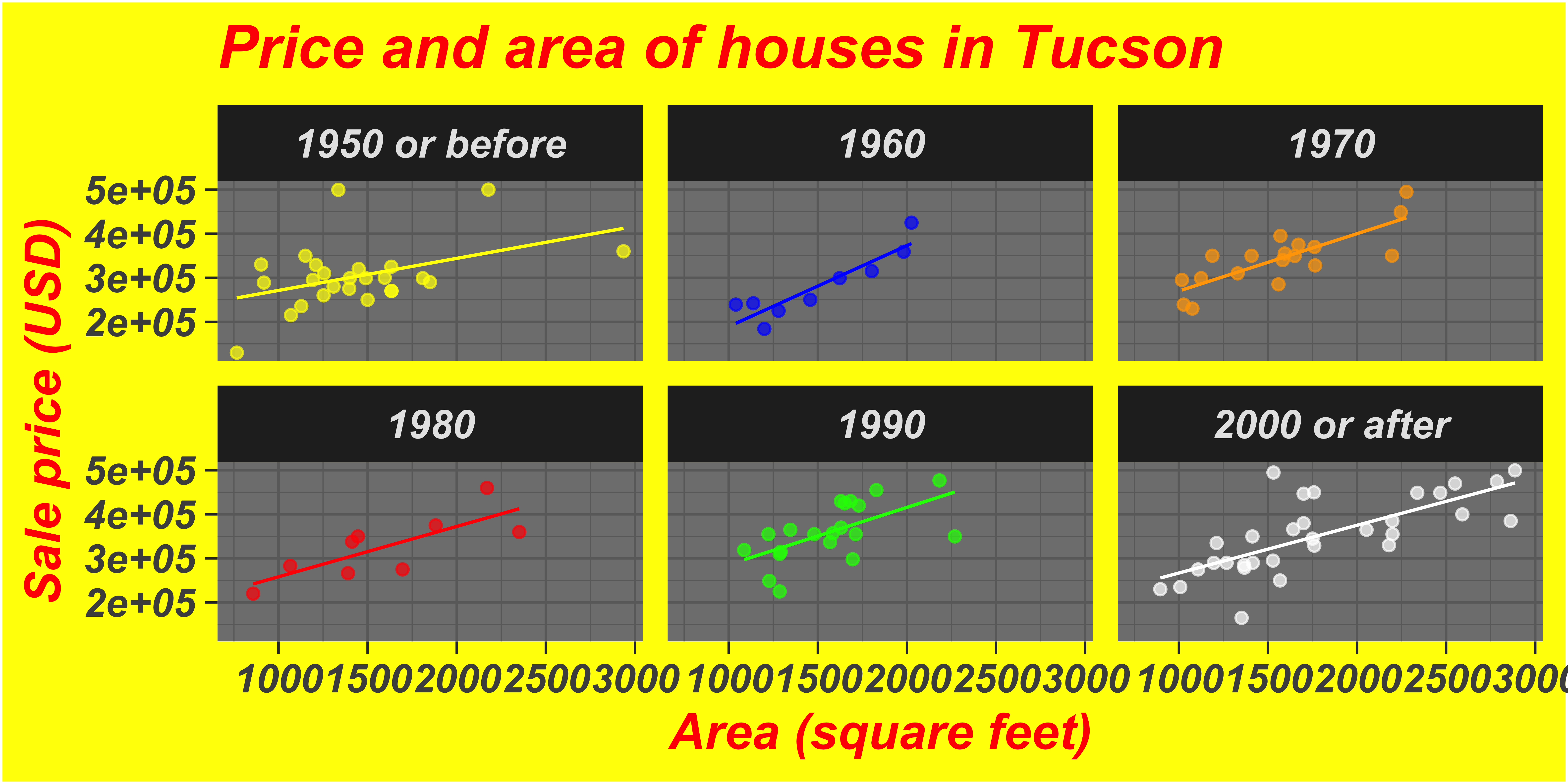
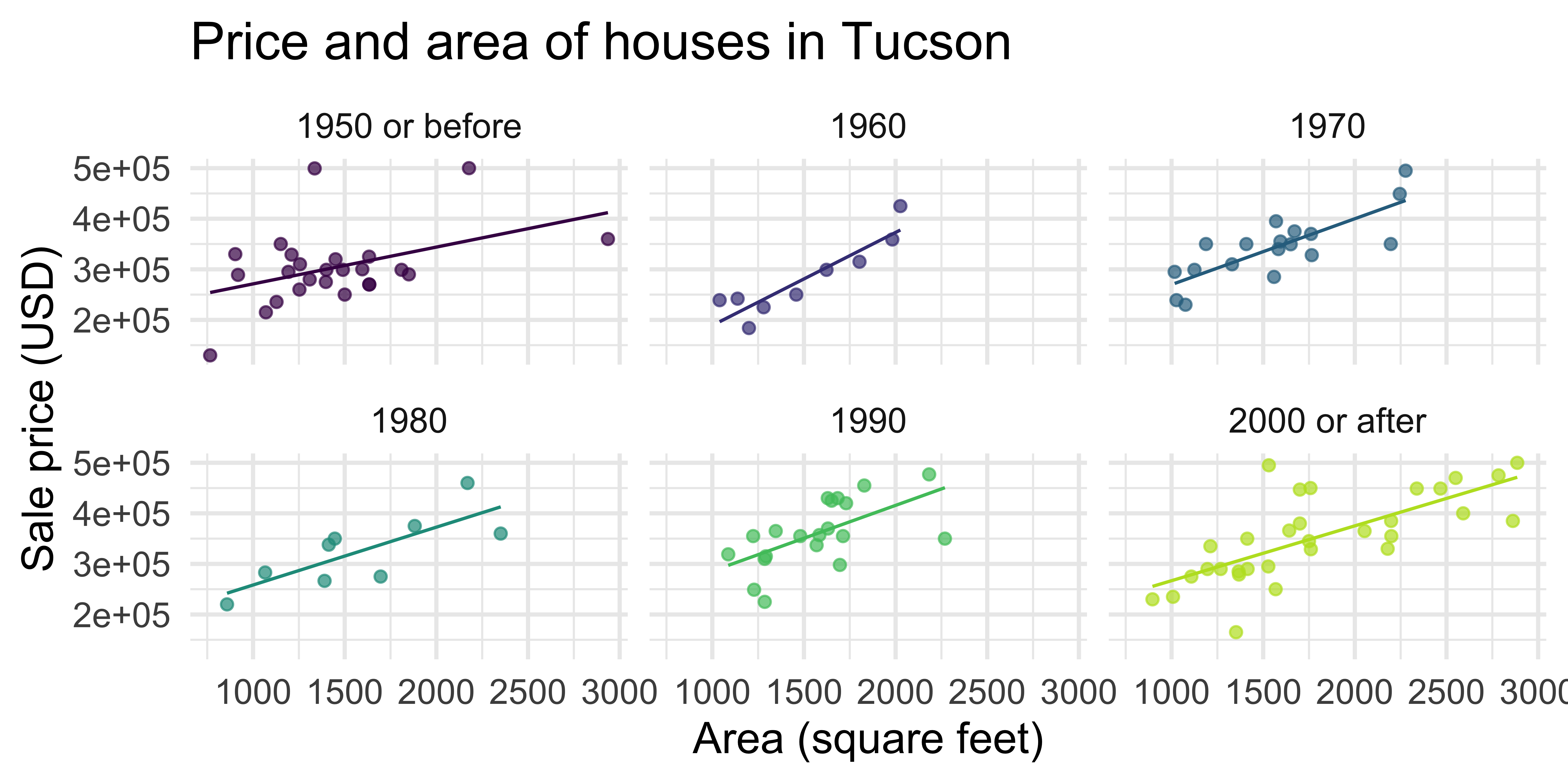
In the next two slides, the same plots are created with different “cosmetic” choices. Examine the plots two given (Plot A and Plot B), and indicate your preference by voting for one of them in the Vote tab.
Test 1
Test 2
What makes figures bad?
Bad taste
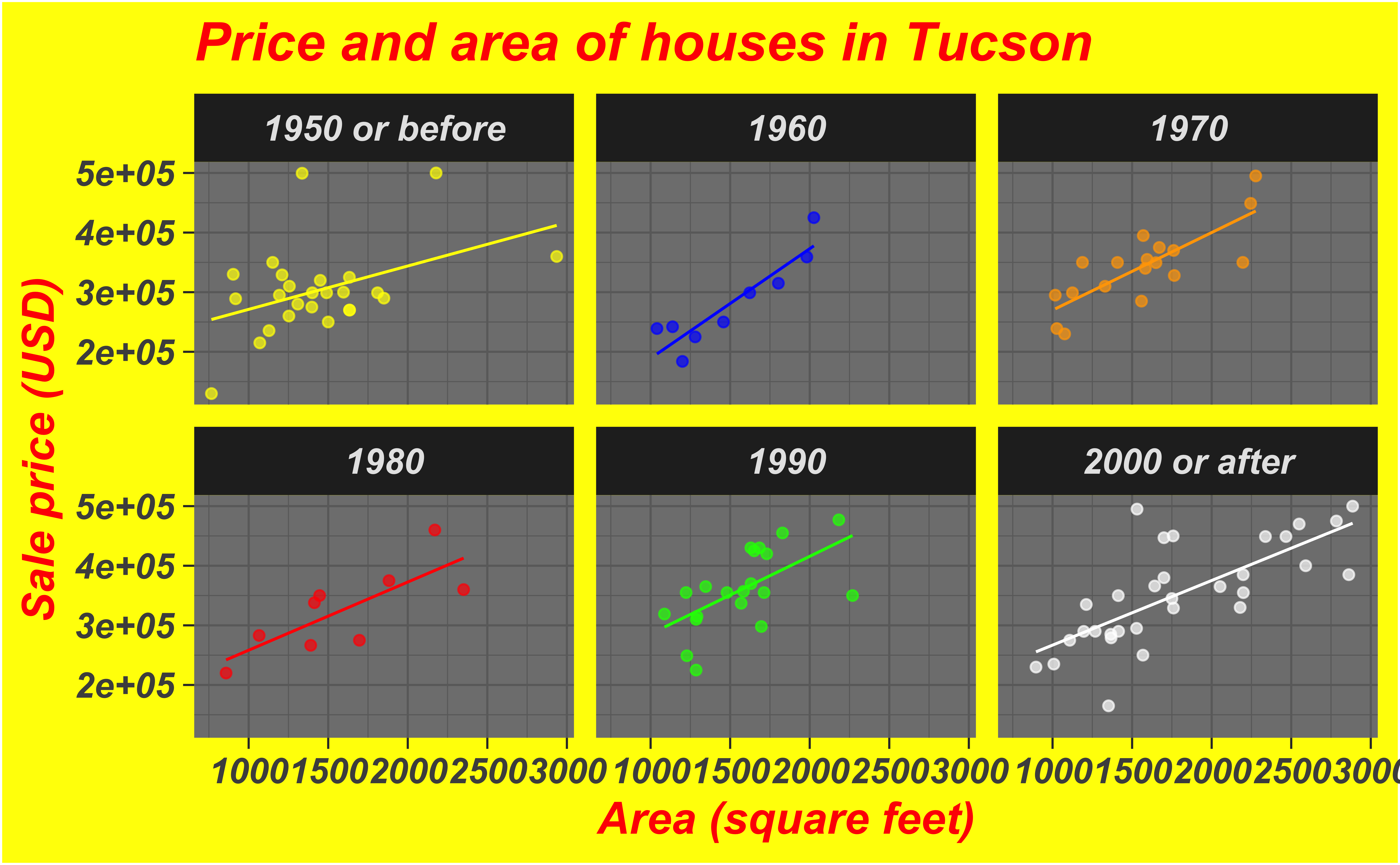
Data-to-ink ratio
Tufte strongly recommends maximizing the data-to-ink ratio this in the Visual Display of Quantitative Information (Tufte, 1983).
Graphical excellence is the well-designed presentation of interesting data—a matter of substance, of statistics, and of design … [It] consists of complex ideas communicated with clarity, precision, and efficiency. … [It] is that which gives to the viewer the greatest number of ideas in the shortest time with the least ink in the smallest space … [It] is nearly always multivariate … And graphical excellence requires telling the truth about the data. (Tufte, 1983, p. 51).
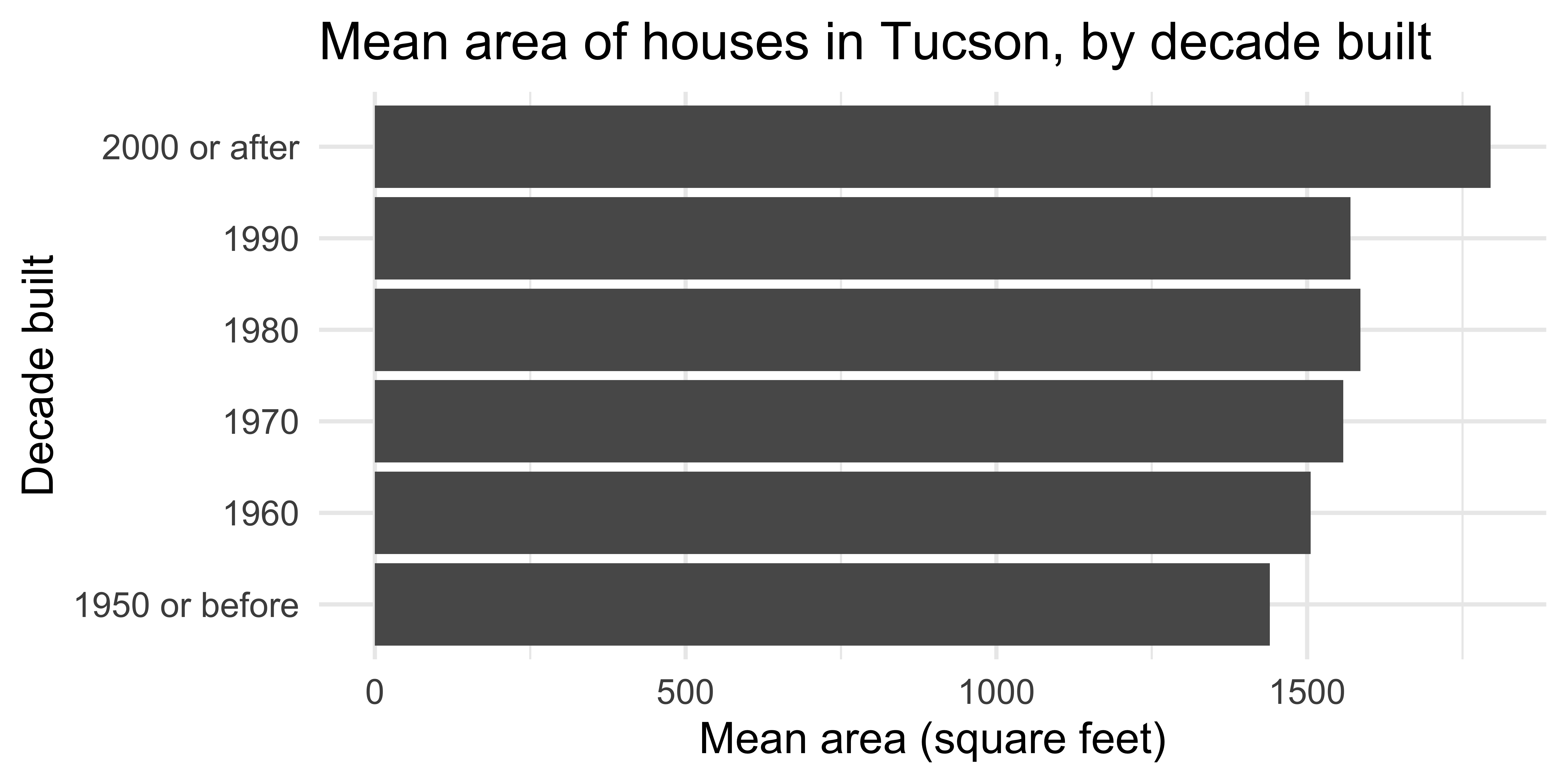
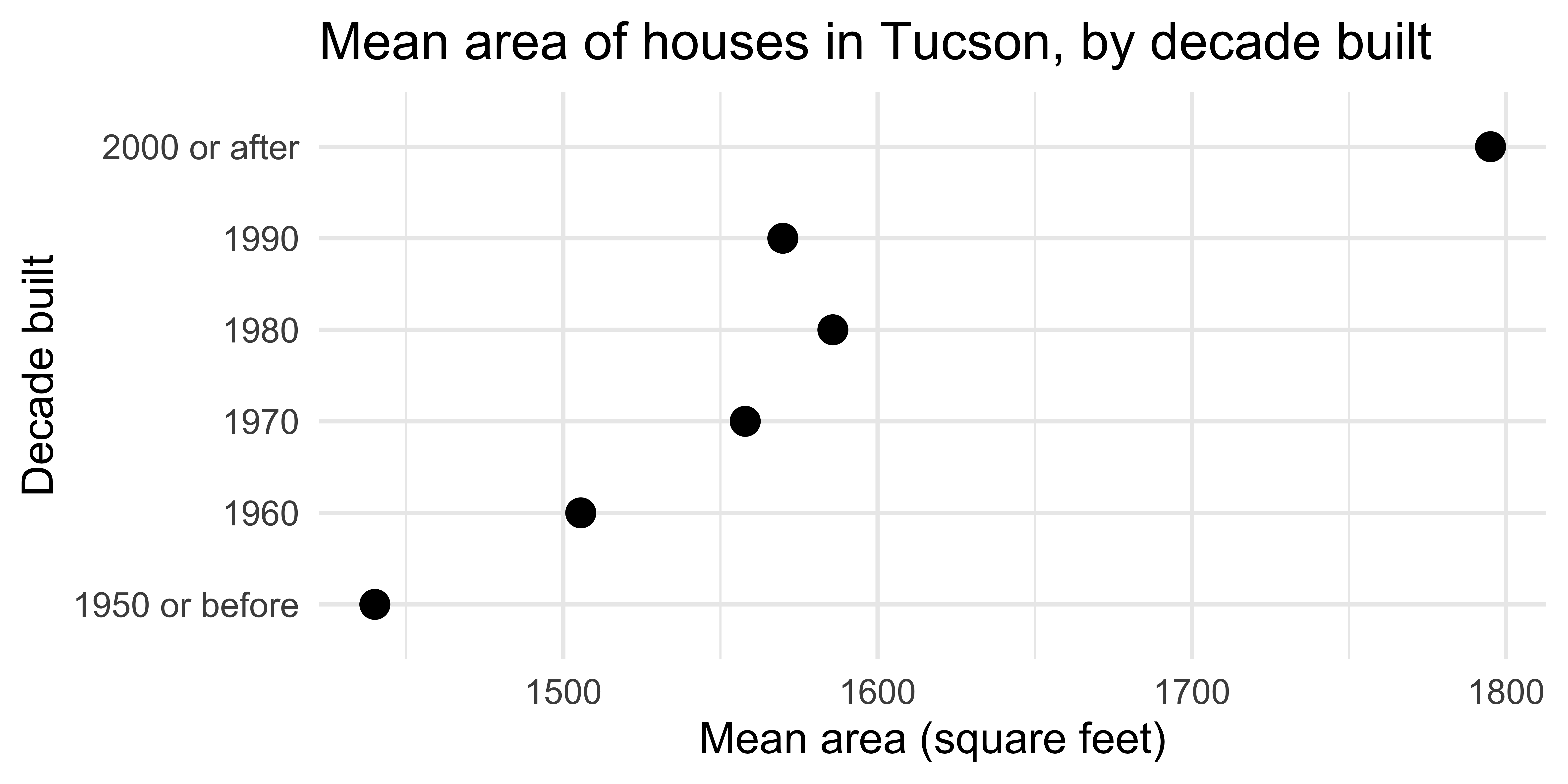
Which of the plots has higher data-to-ink ratio?
A deeper look
at the plotting code
Summary statistics
Barplot
Scatterplot
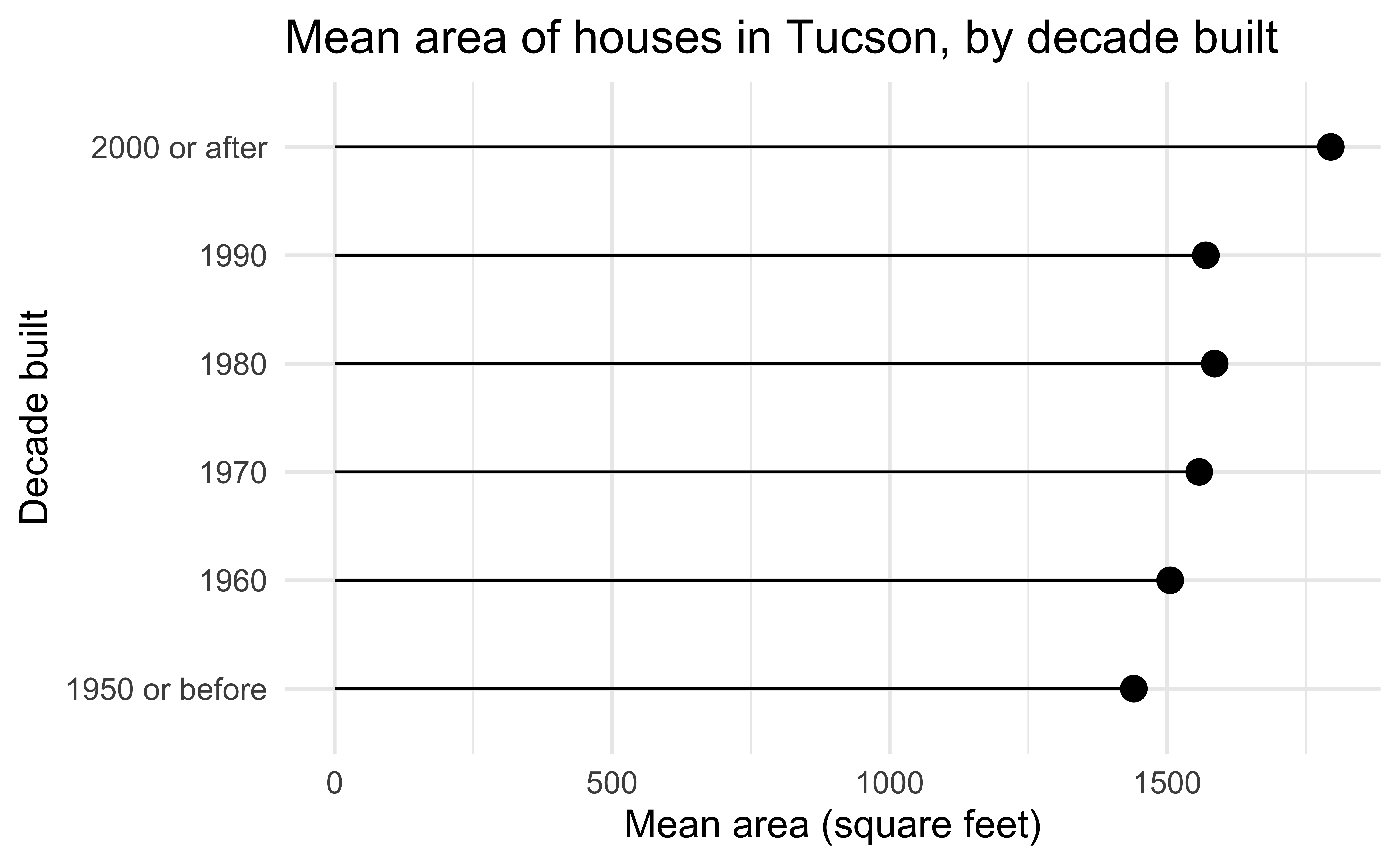
Lollipop chart – a happy medium?
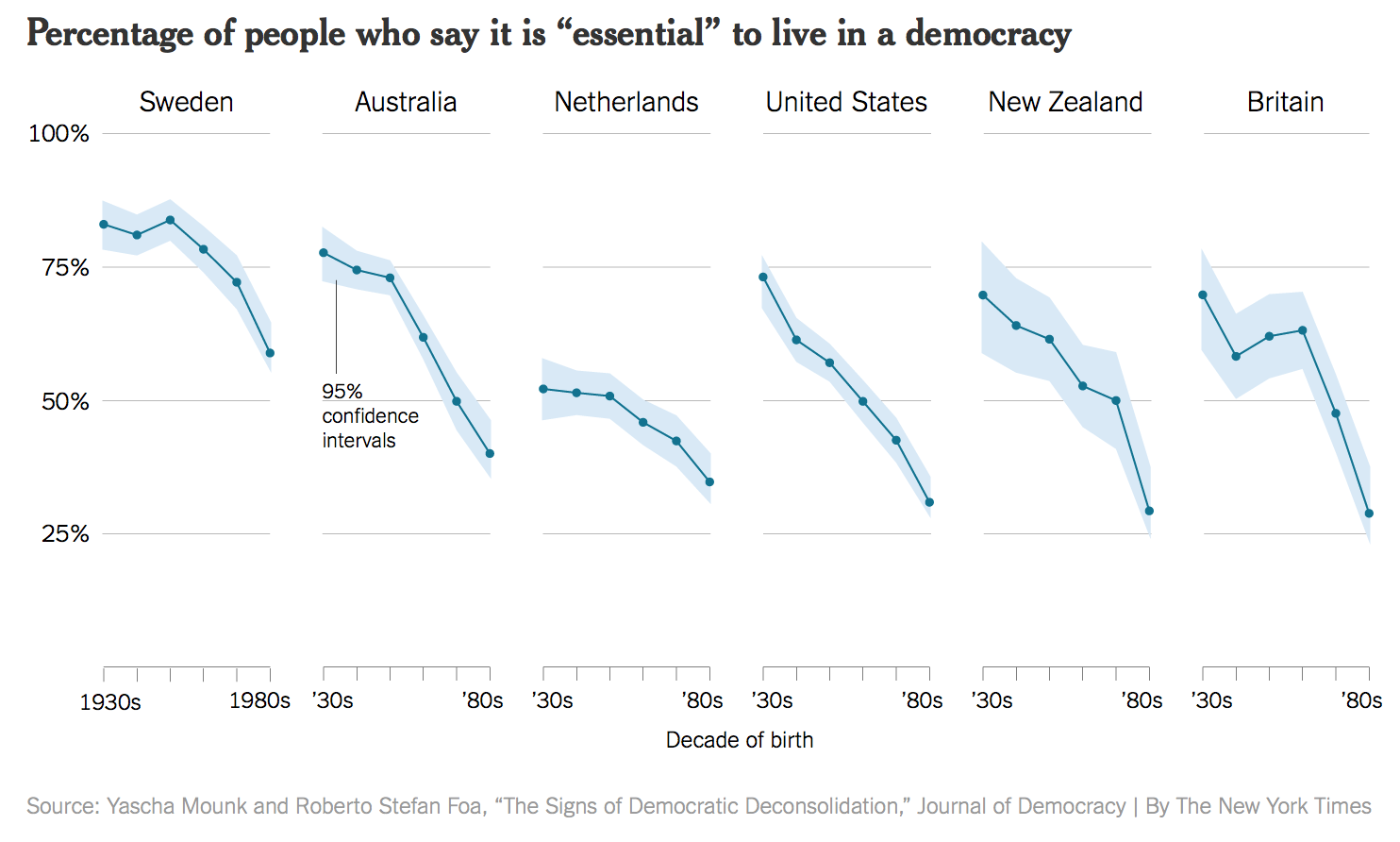
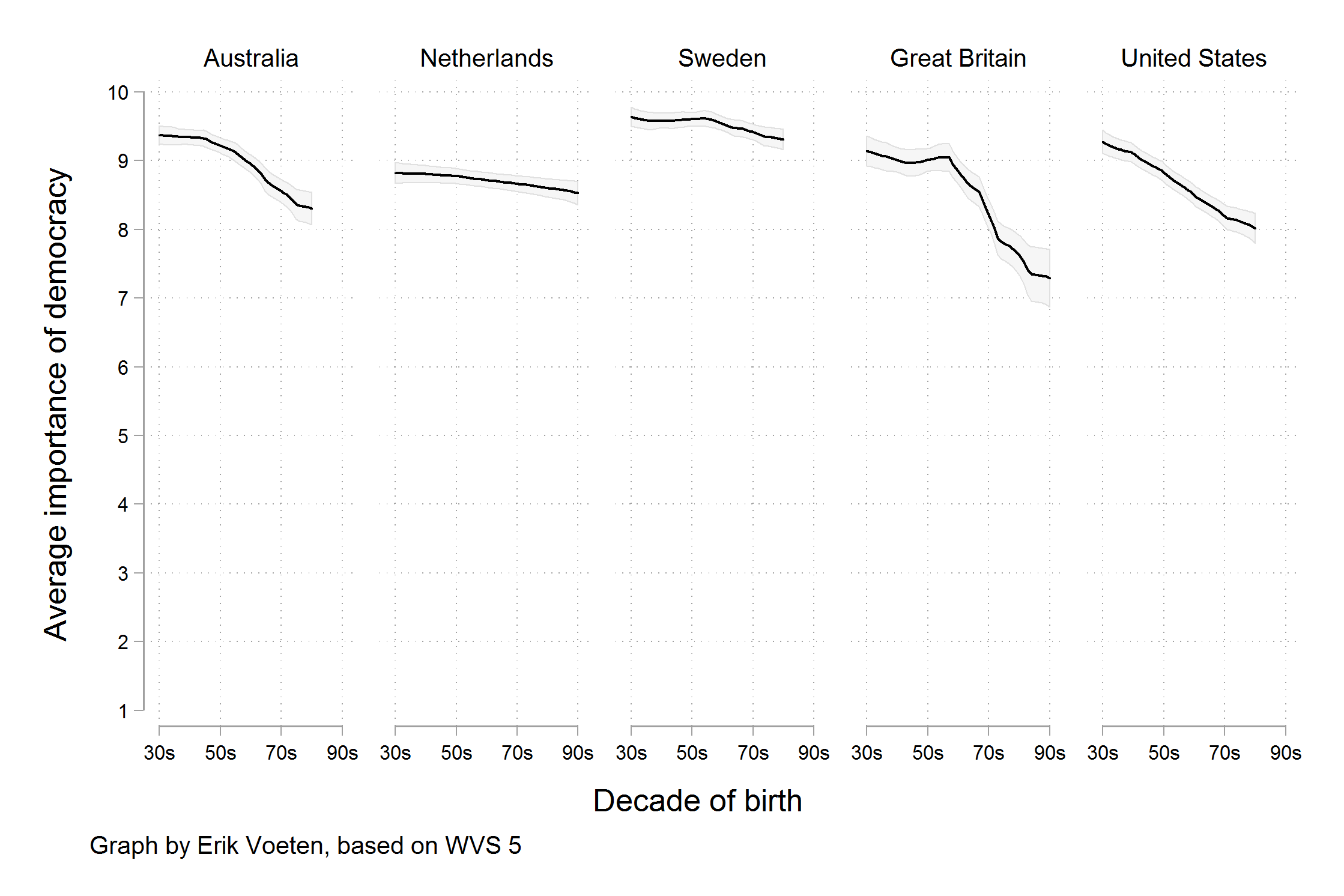
Bad data
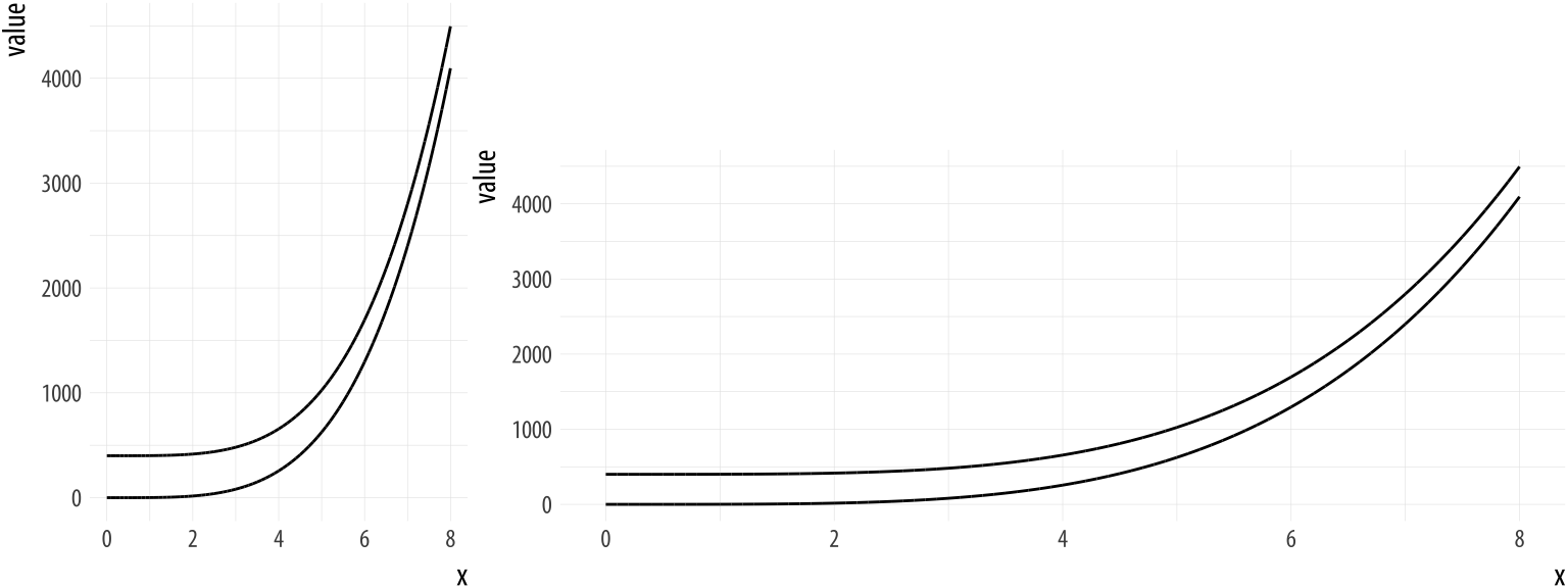
Bad perception
Aesthetic mappings in ggplot2
A second look: lollipop chart
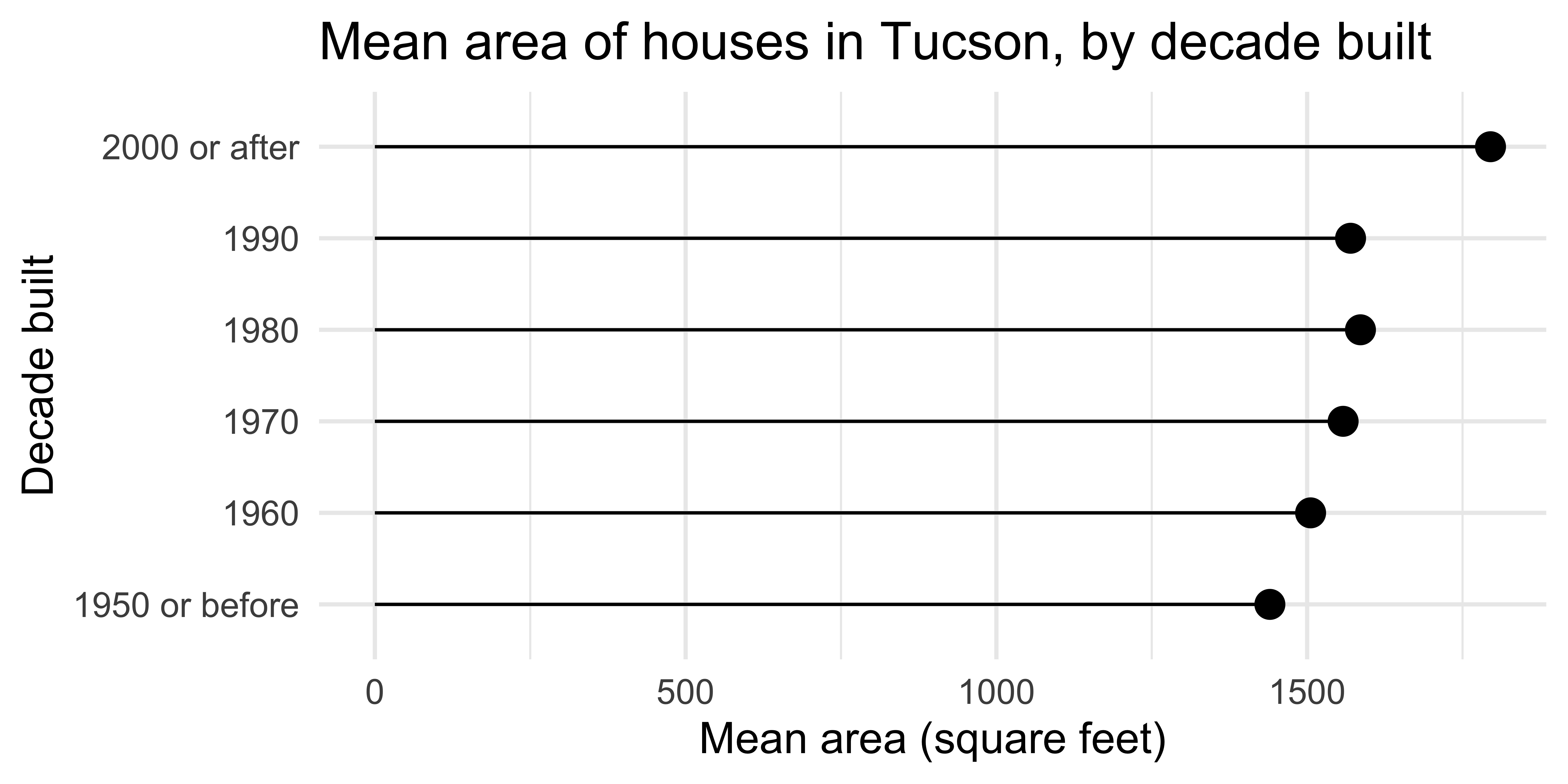
ggplot(
  mean_area_decade,
  aes(y = decade_built_cat, x = mean_area)
) +
  geom_point(size = 4) +
  geom_segment(aes(
    x = 0, xend = mean_area,
    y = decade_built_cat, yend = decade_built_cat
  )) +
  labs(
    x = "Mean area (square feet)",
    y = "Decade built",
    title = "Mean area of houses in Tucson, by decade built"
  )
Activity: Spot the differences |

Can you spot the differences between the code here and the one provided in the previous slide? Are there any differences in the resulting plot? Work in a pair (or group) to answer.
03:00
Global vs. layer-specific aesthetics
Aesthetic mappings can be supplied in the initial
ggplot()call, in individual layers, or in some combination of both.Within each layer, you can add, override, or remove mappings.
If you only have one layer in the plot, the way you specify aesthetics doesn’t make any difference. However, the distinction is important when you start adding additional layers.
Activity: Spot the differences II
Do you expect the following plots to be the same or different? If different, how? Discuss in a pair (or group) without running the code and sketch the resulting plots based on what you think the code will produce.
Plot
03:00
Wrap up
Think back to all the plots you saw in the lecture, without flipping back through the slides. Which plot first comes to mind? Describe it in words.
