# load packages
library(countdown)
library(tidyverse)
library(ggrepel)
library(patchwork)
library(ggtext)

# set theme for ggplot2
ggplot2::theme_set(ggplot2::theme_minimal(base_size = 16))

# set figure parameters for knitr
knitr::opts_chunk$set(
  fig.width = 7, # 7" width
  fig.asp = 0.618, # the golden ratio
  fig.retina = 3, # dpi multiplier for displaying HTML output on retina
  fig.align = "center", # center align figures
  dpi = 300 # higher dpi, sharper image
)Presentation ready plots
Lecture 11
Keep it simple
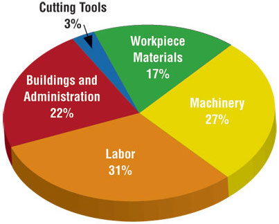
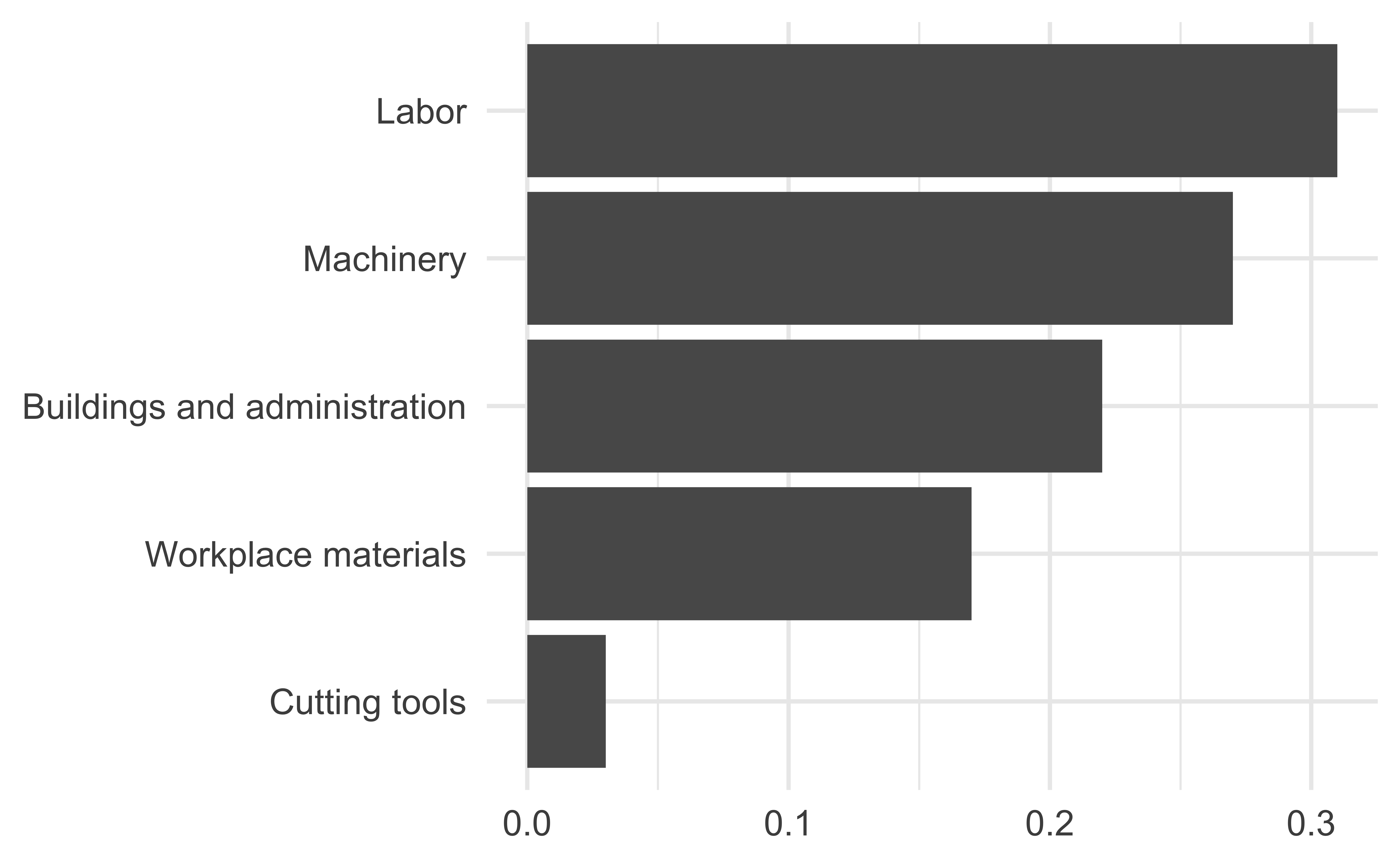
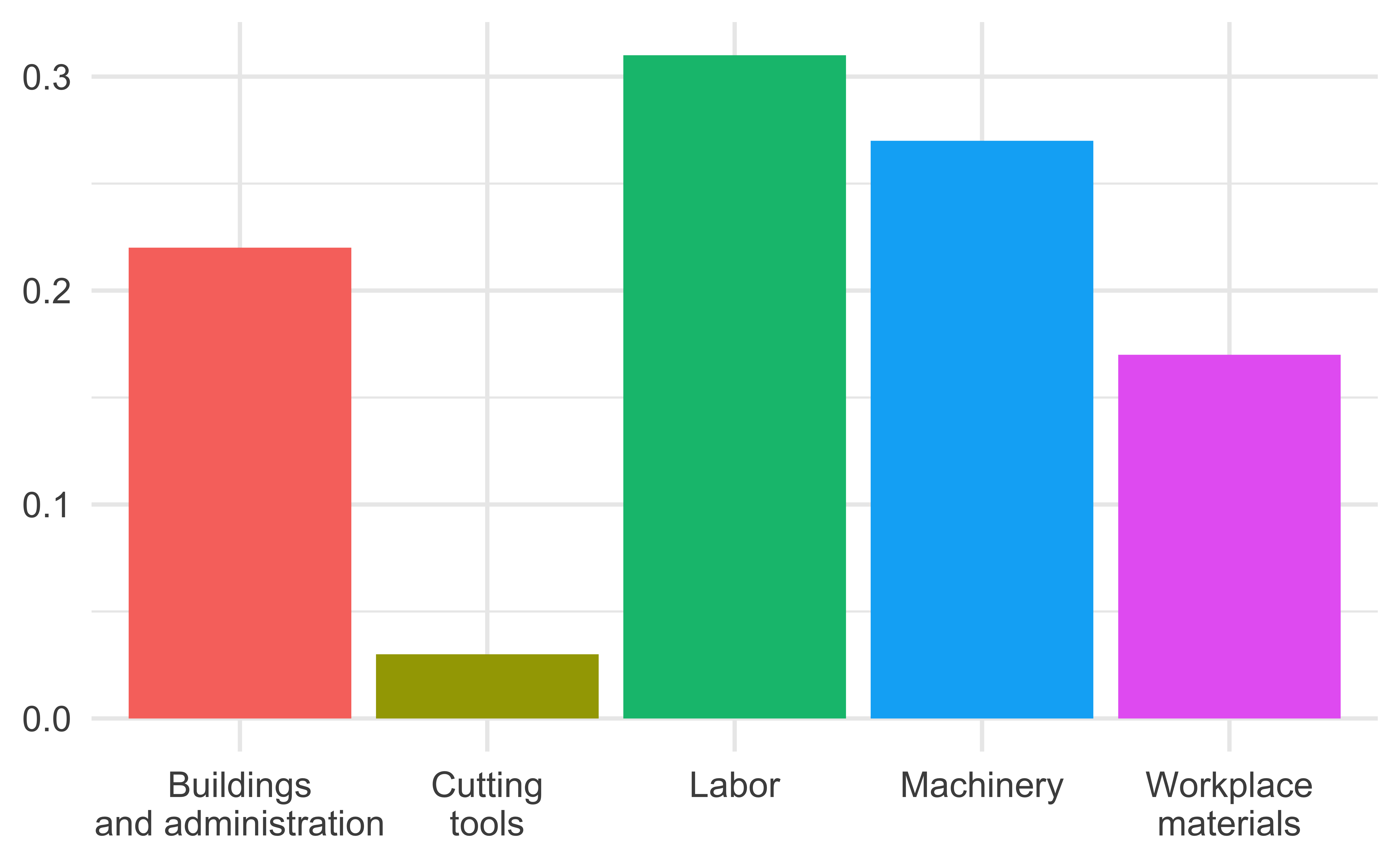
Judging relative area
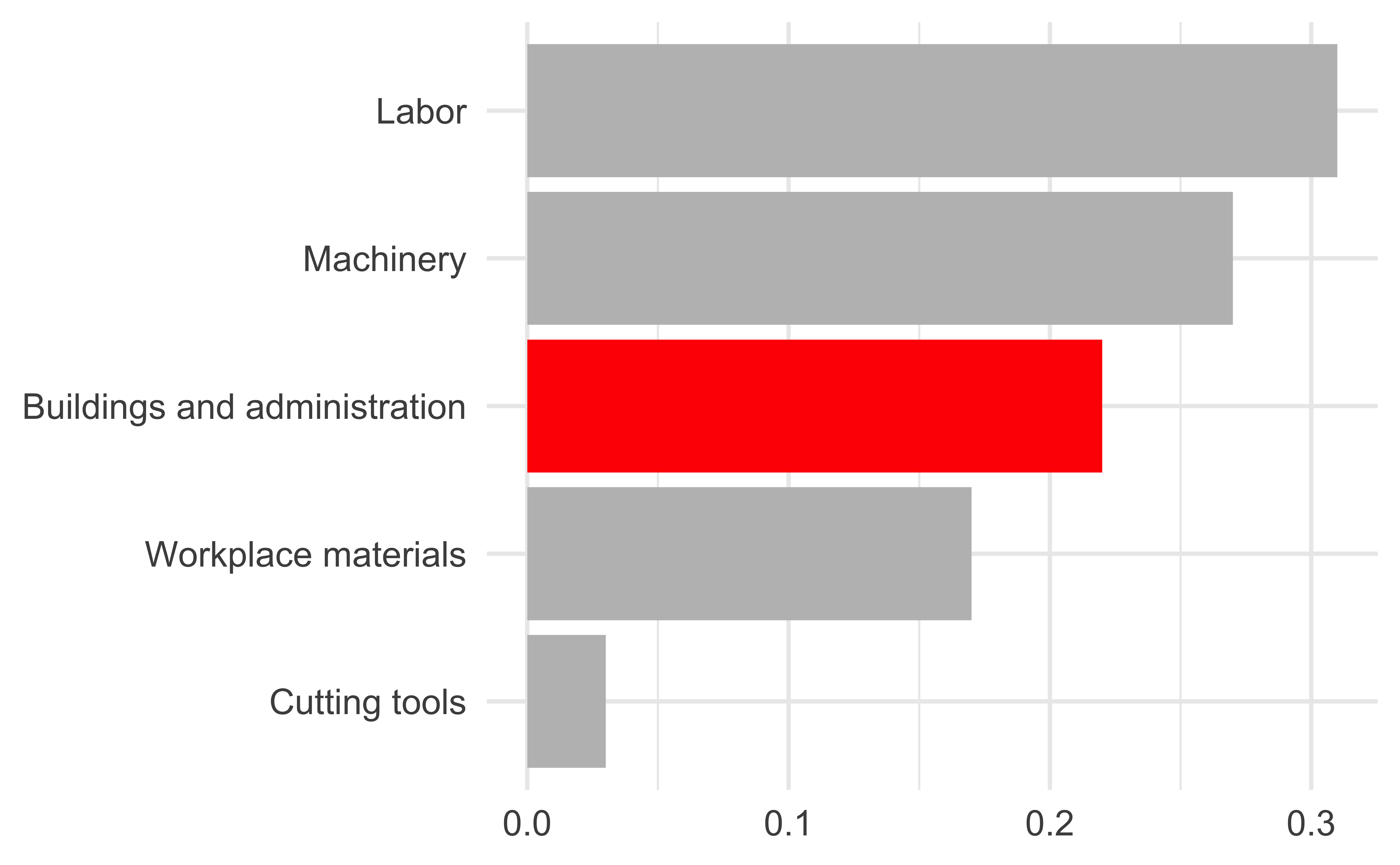
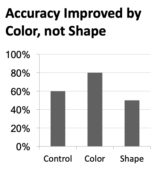
Use color to draw attention
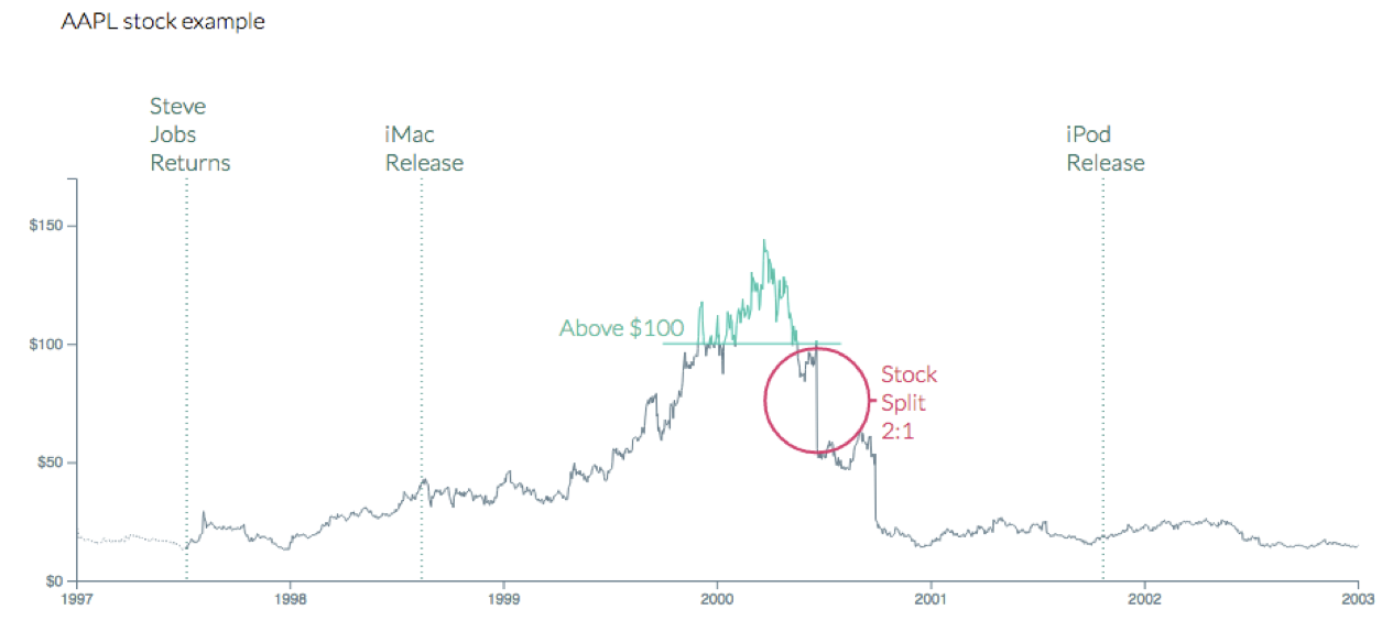
Tell a story
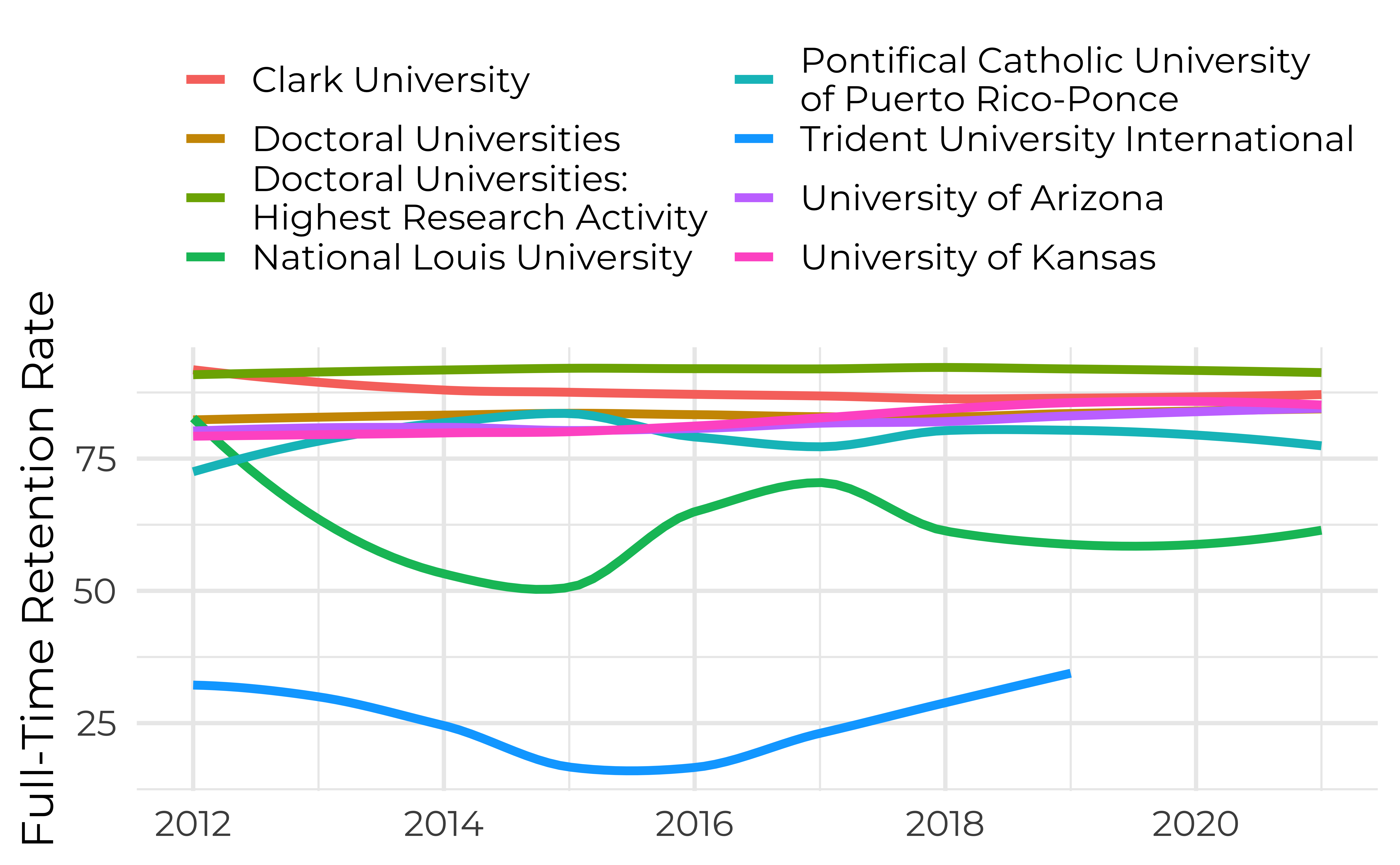
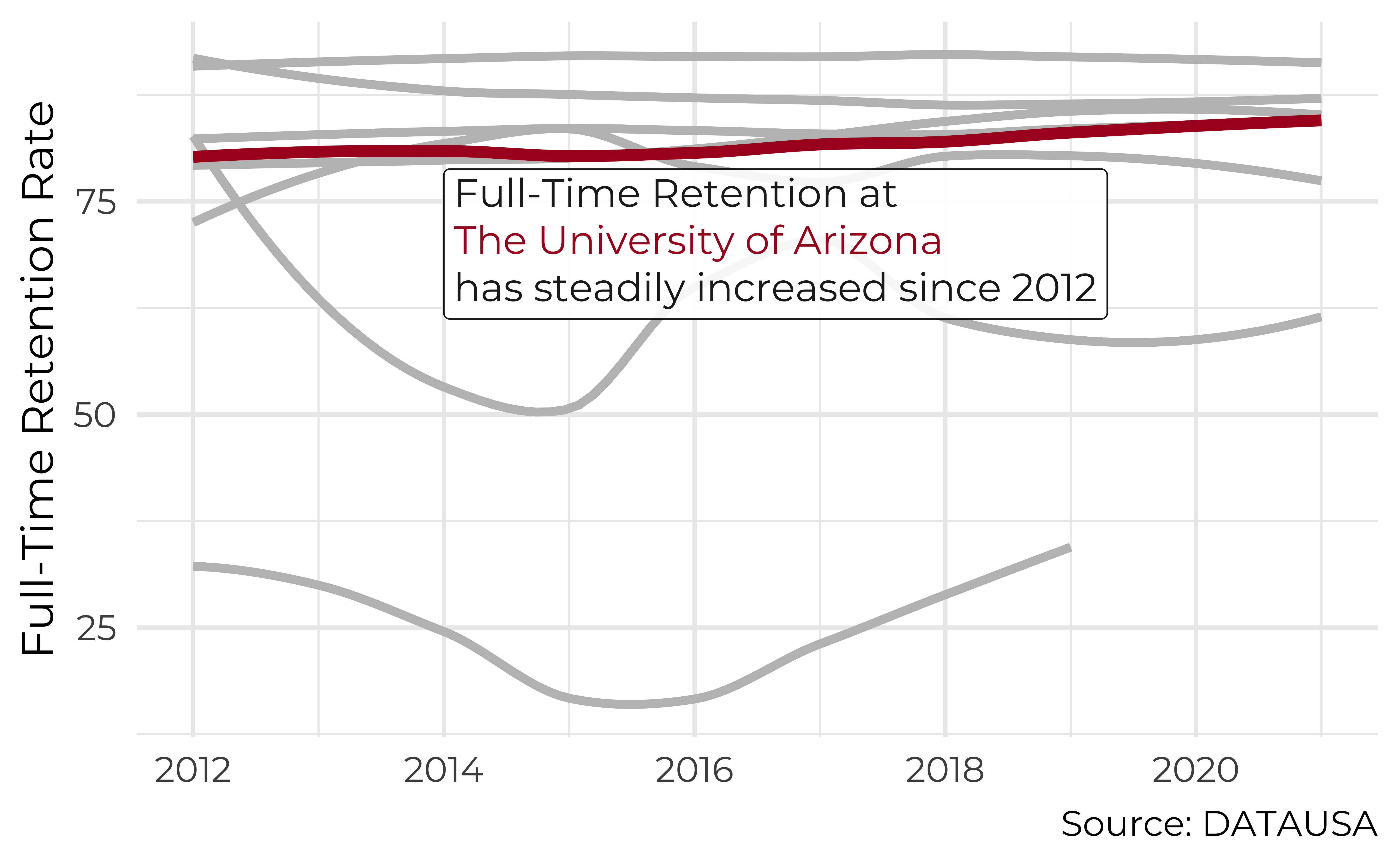
Leave out non-story details
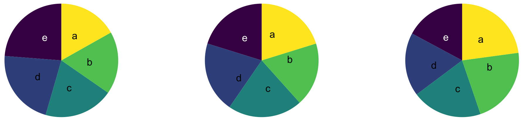
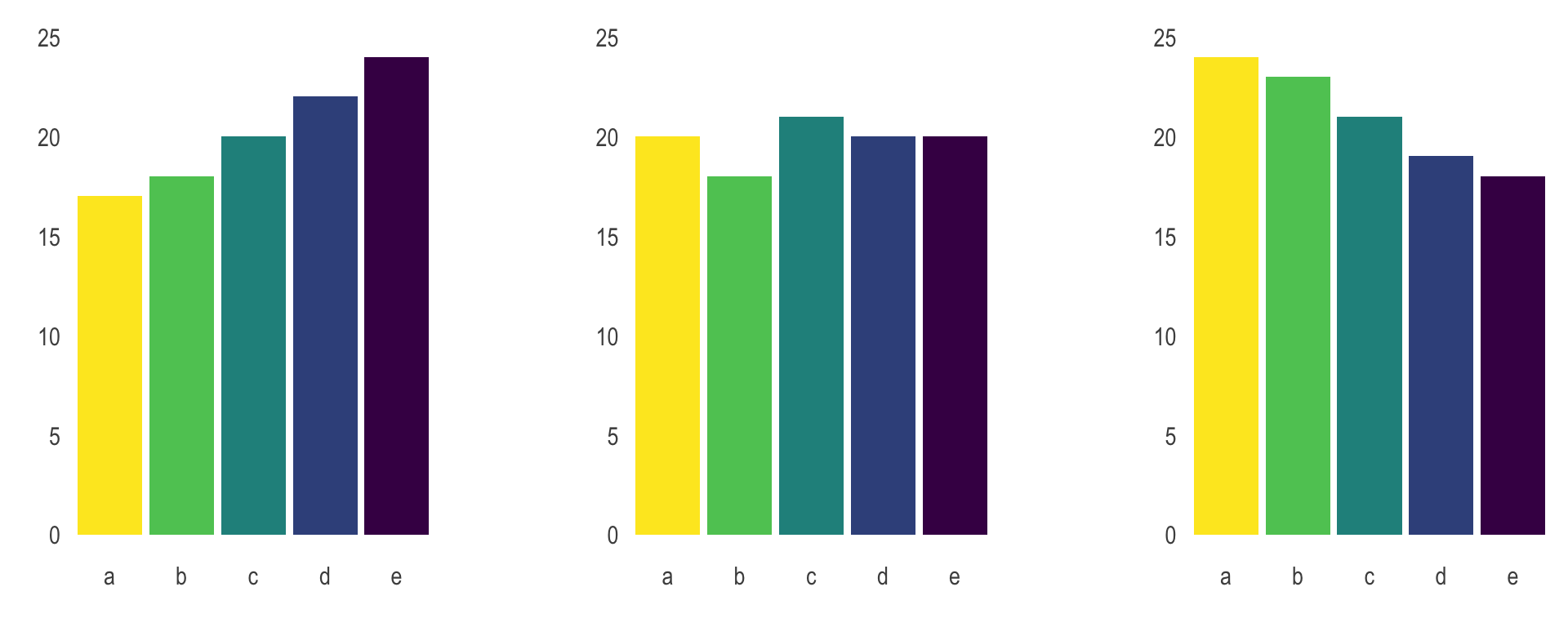
Order matters
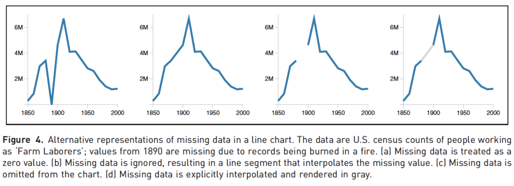
Clearly indicate missing data
Reduce cognitive load
Use descriptive titles
Annotate figures
Slide with single plot, little text
The plot will fill the empty space in the slide.
Slide with single plot, lots of text
If there is more text on the slide
The plot will shrink
To make room for the text

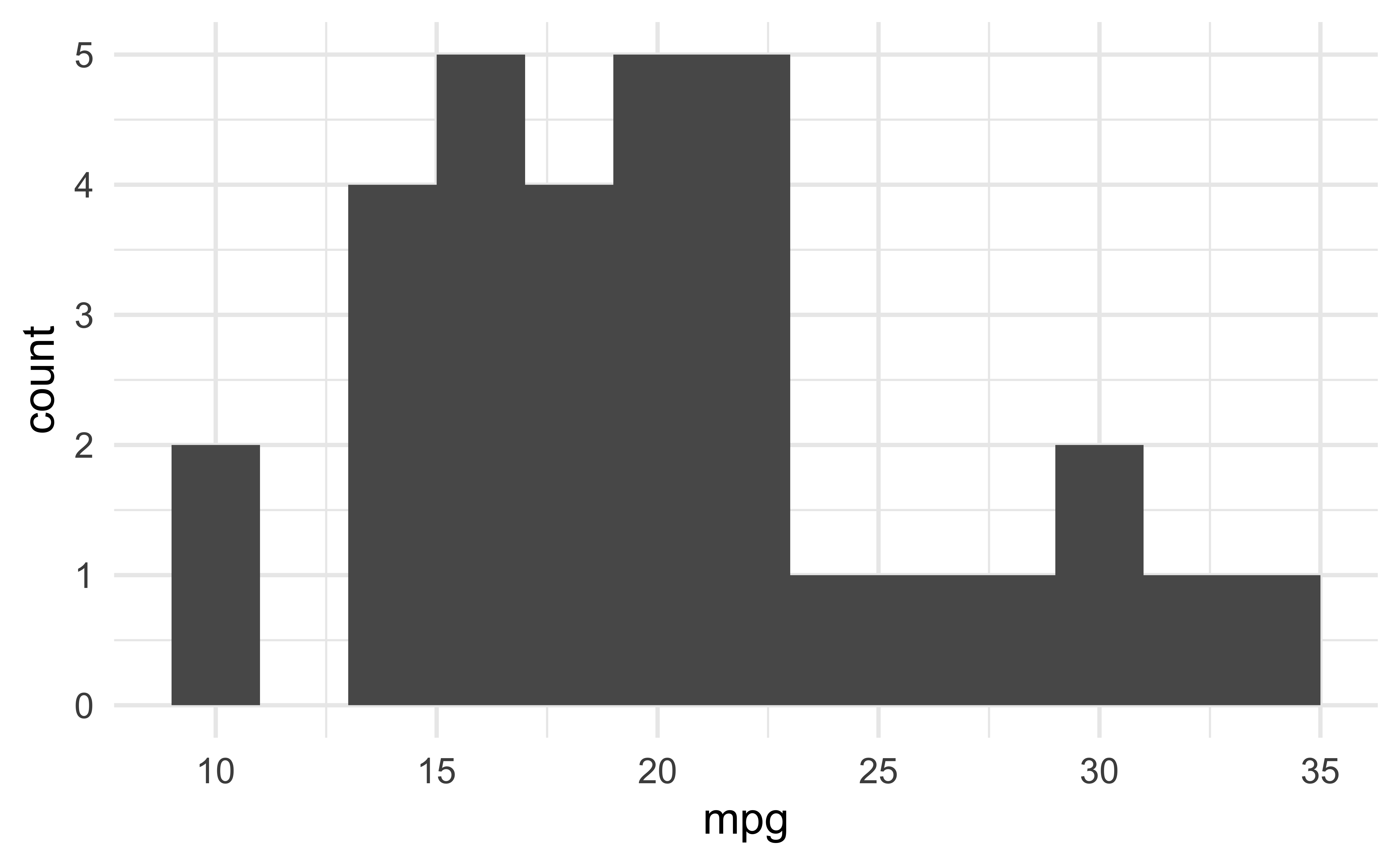
Small fig-width
For a zoomed-in look
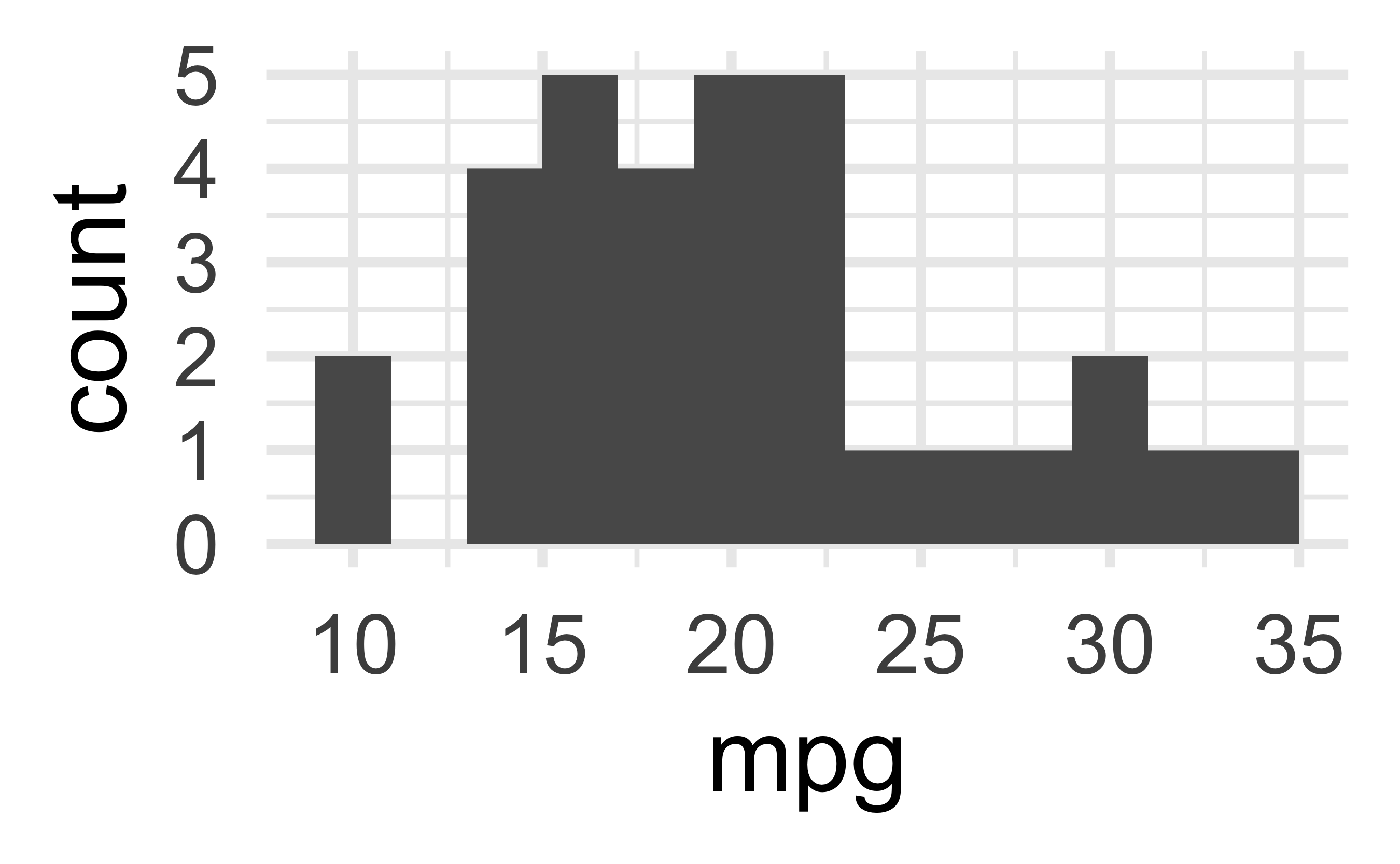
Large fig-width
For a zoomed-out look
fig-width affects text size
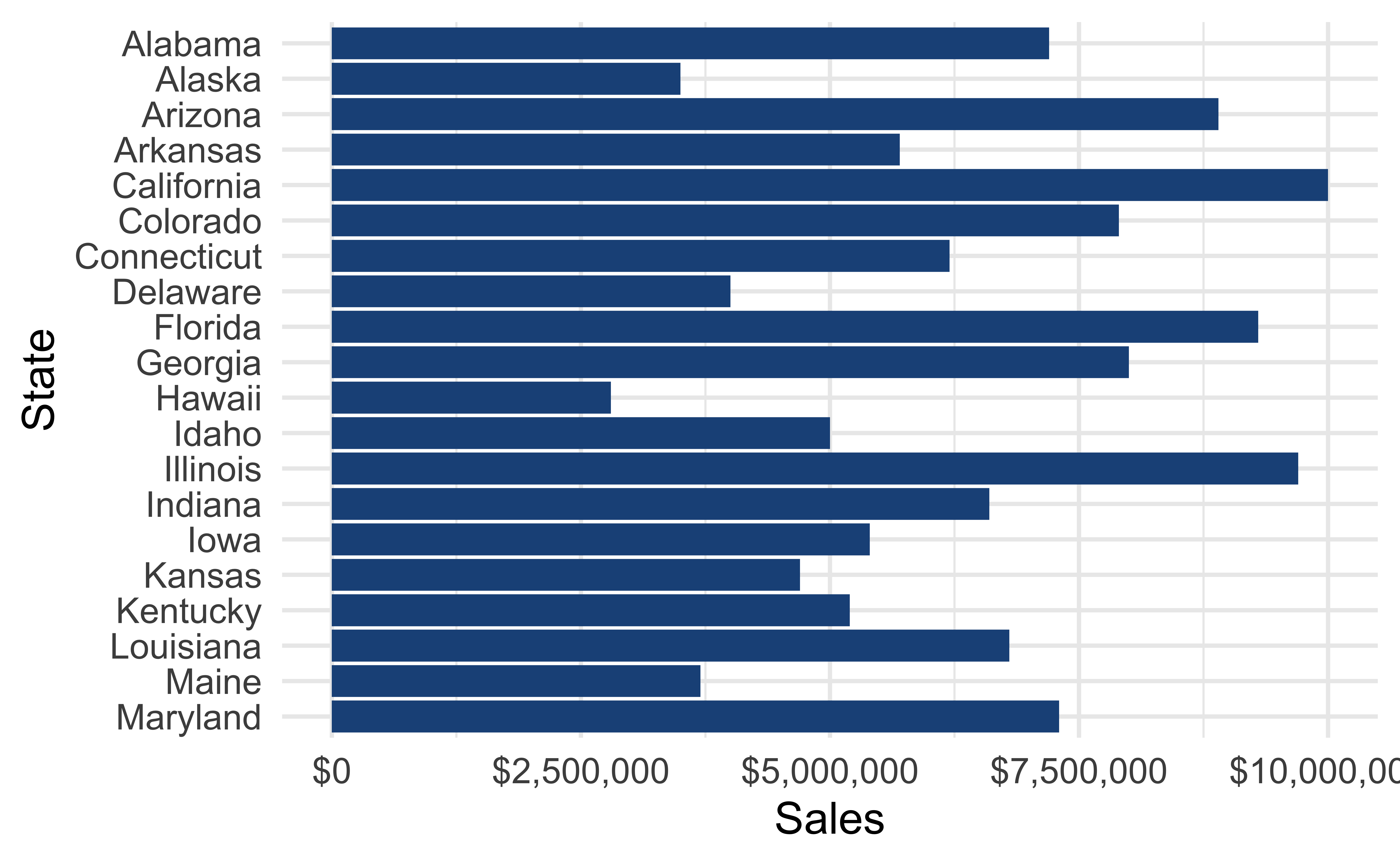
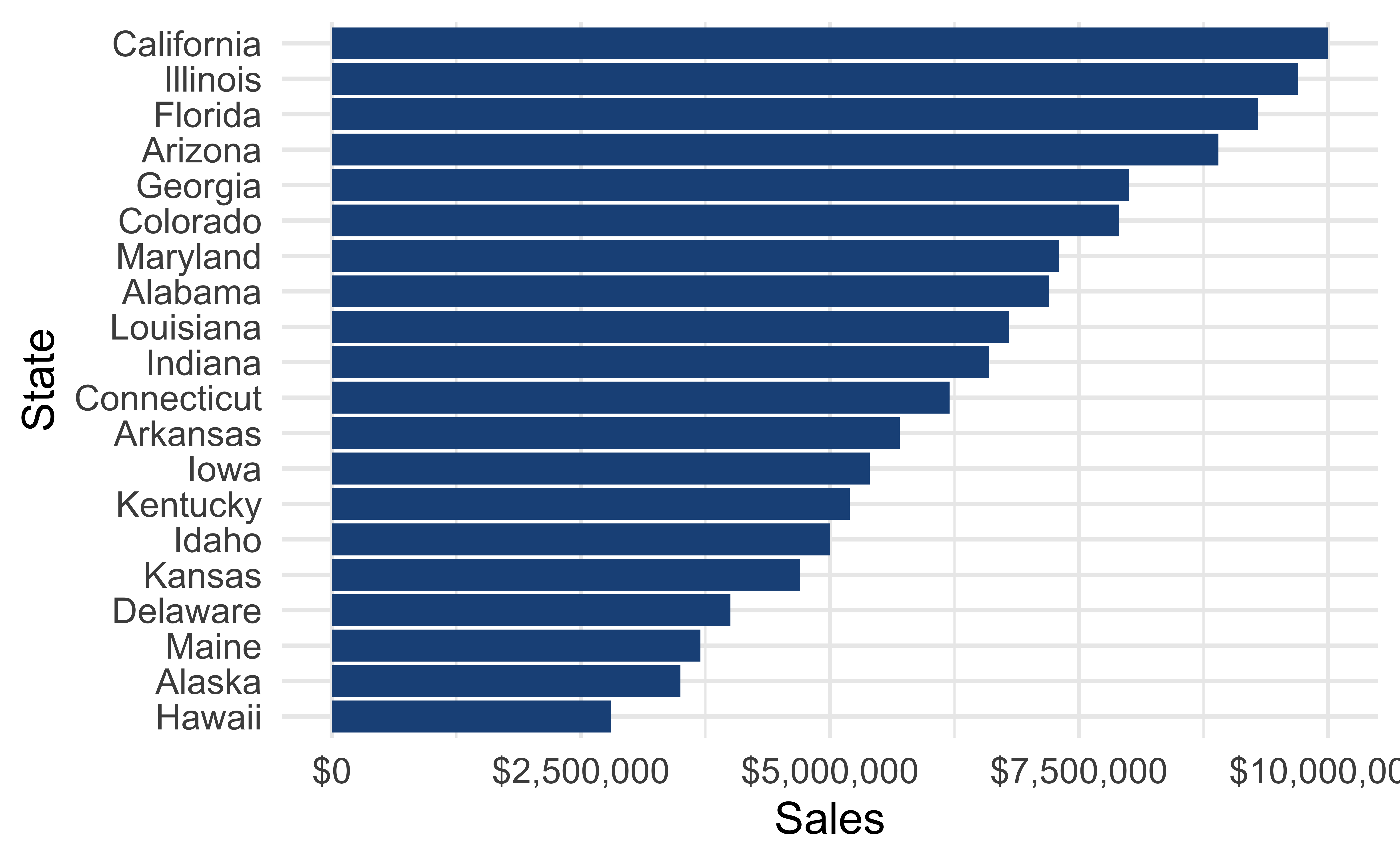
Columns
Insert > Slide Columns
Quarto will automatically resize your plots to fit side-by-side.
layout-ncol


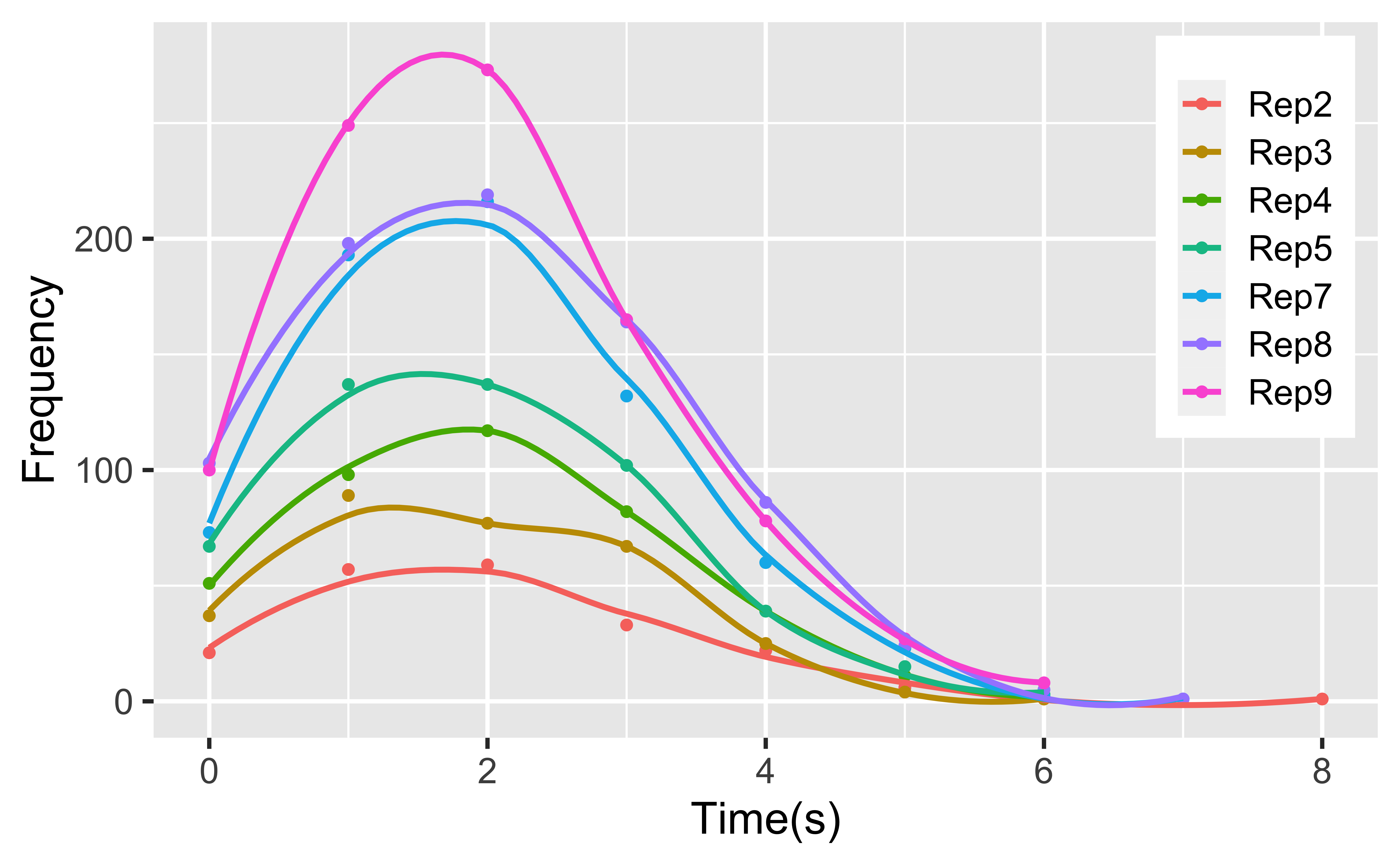
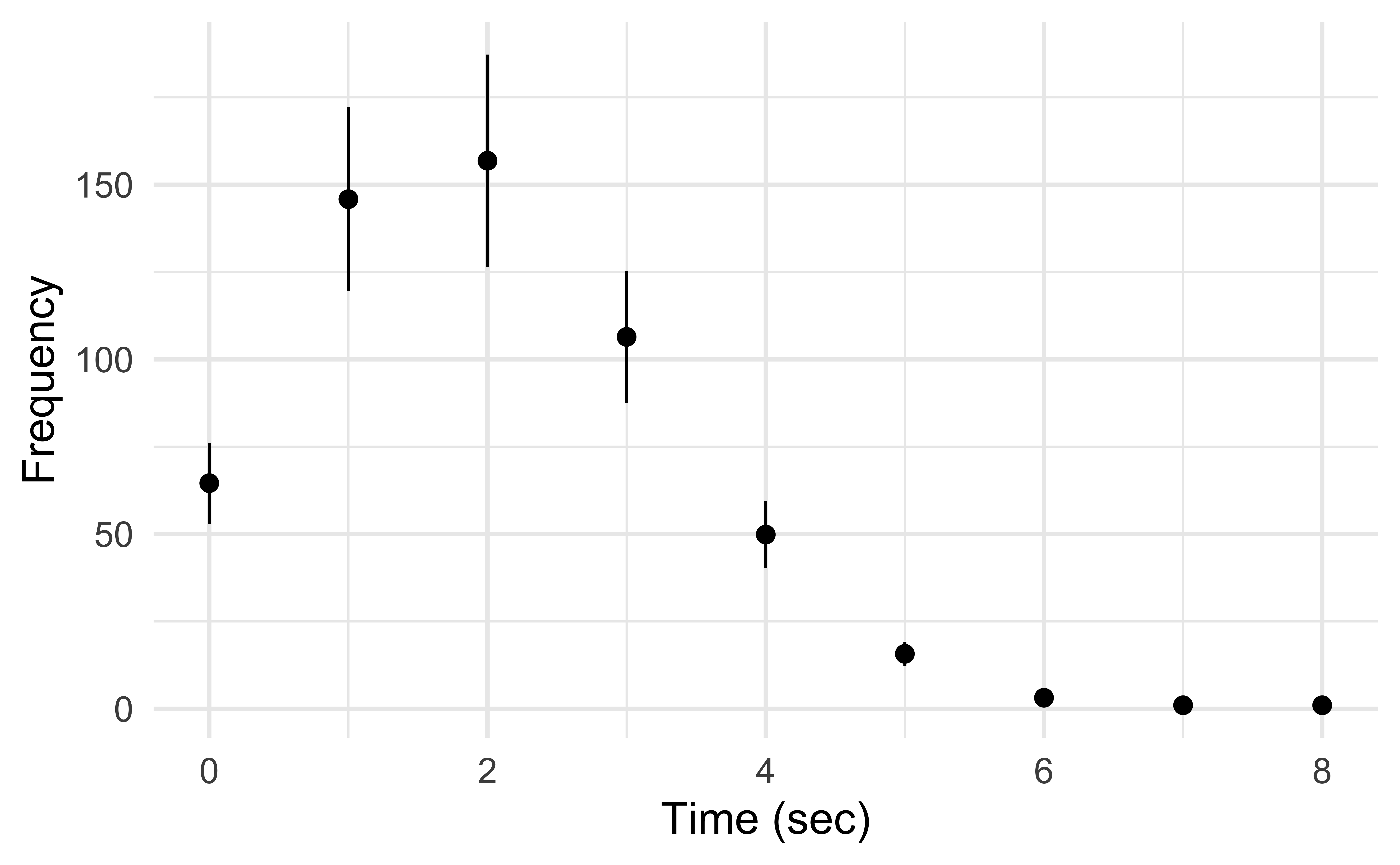
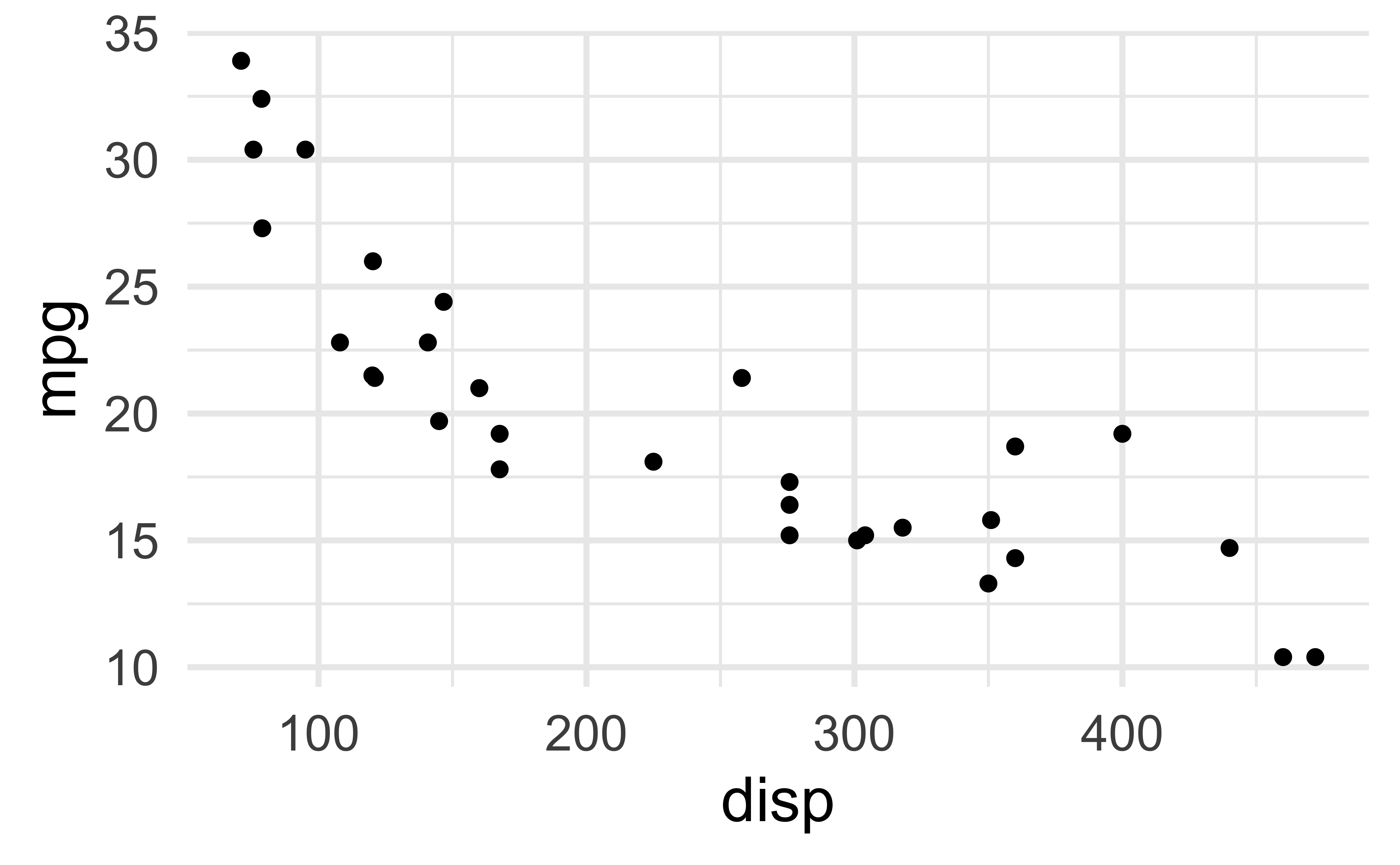
patchwork
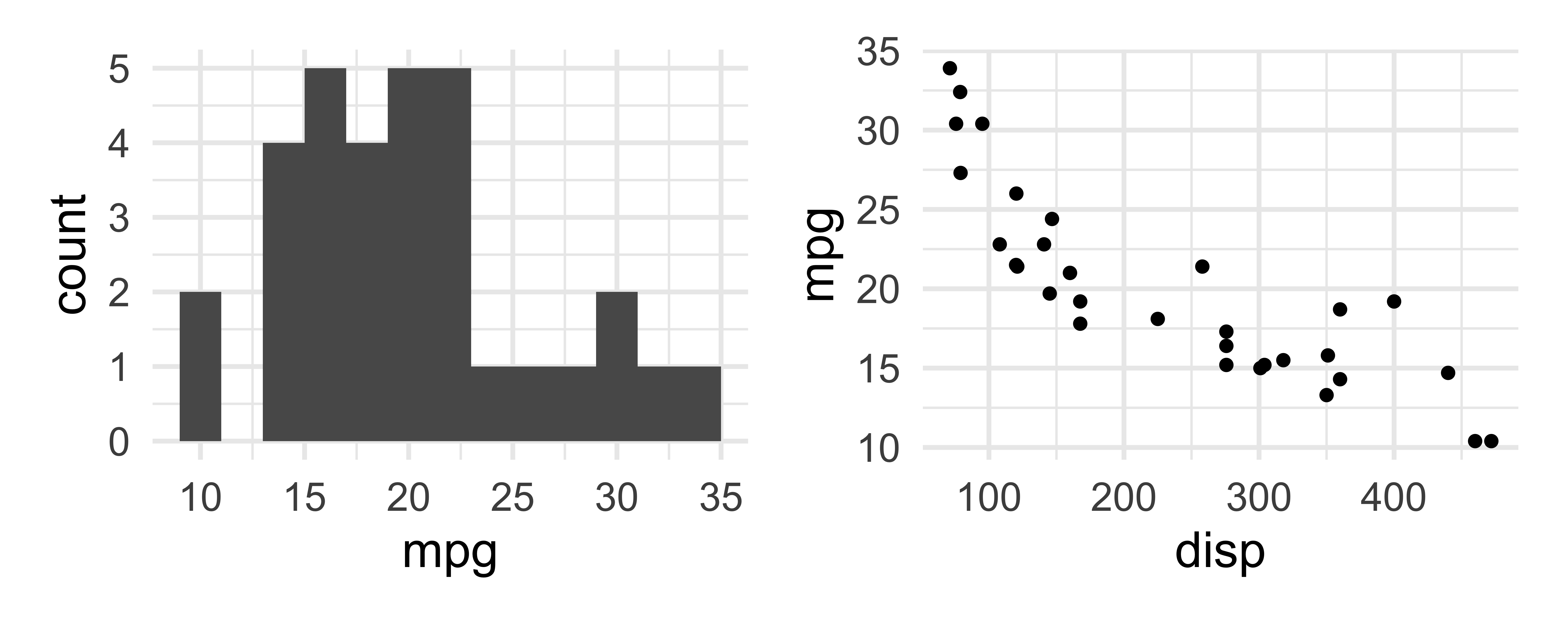
patchwork layout I
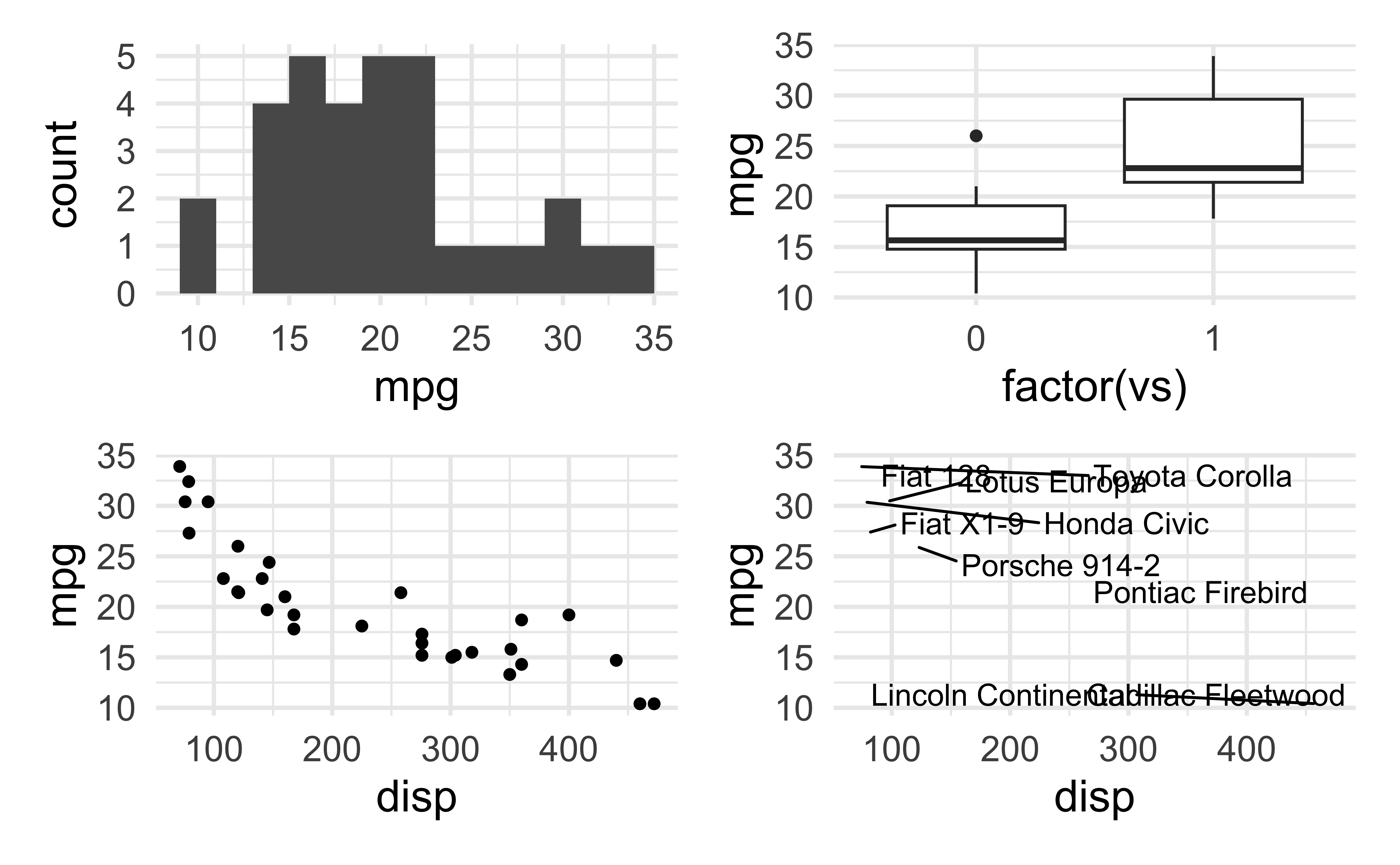
patchwork layout II
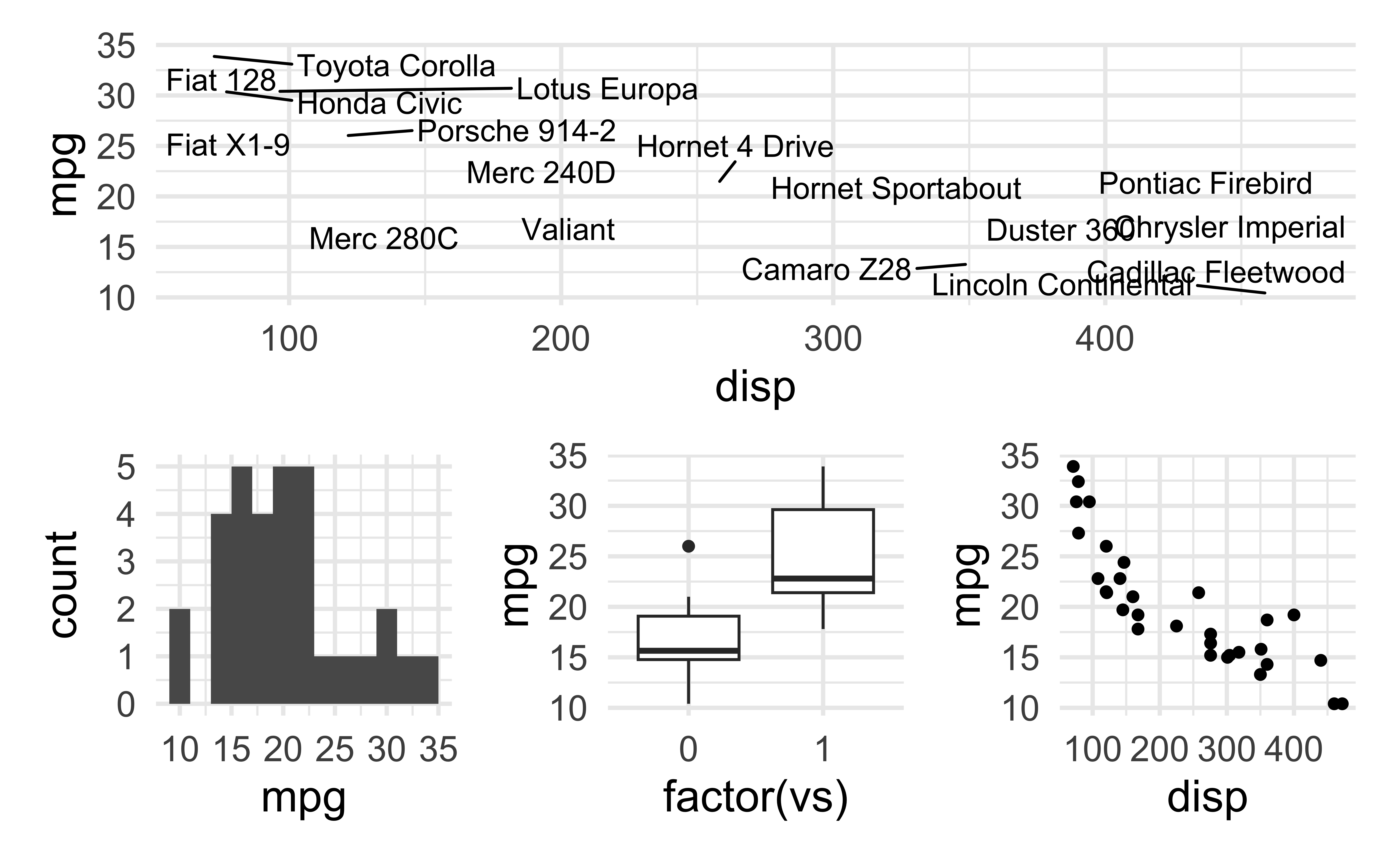
patchwork layout III
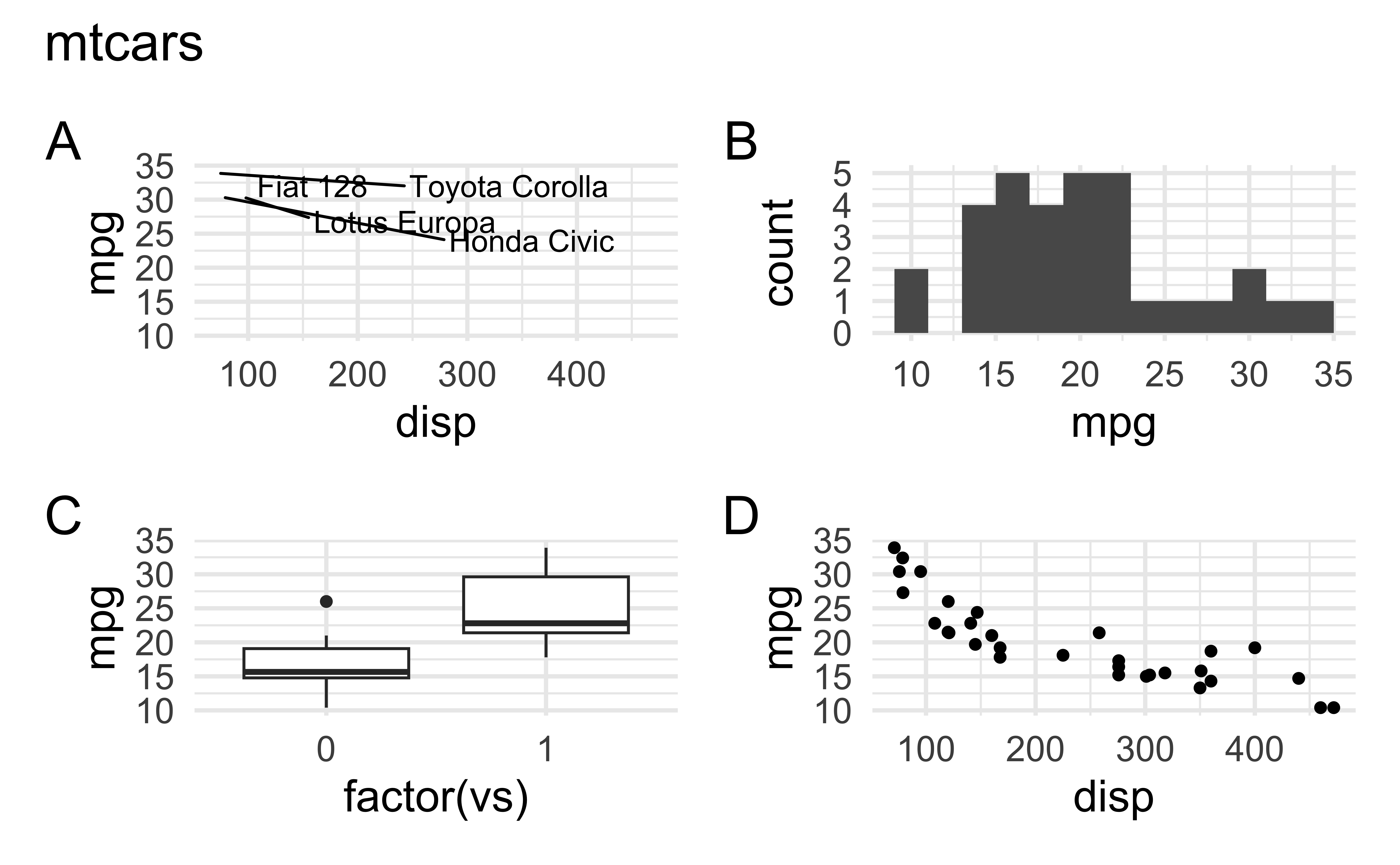
patchwork layout IV
Want to replicate something you saw in my slides?
Look into the source code at https://github.com/INFO-526-S24/INFO526-S24/slides/.
![]()