Dashboards I
Lecture 24
Several (common) tools


Key performance indicators (KPIs)
Lagging KPI:
- Performance indicator of something that has happened

Leading KPI:
- Performance indicator that signals something to come

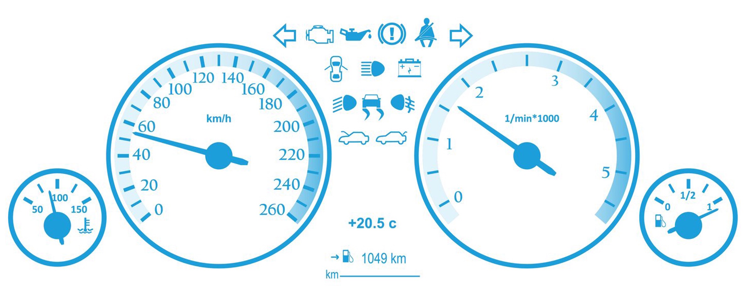
Dashboards
Named after car dashboards
Value boxes
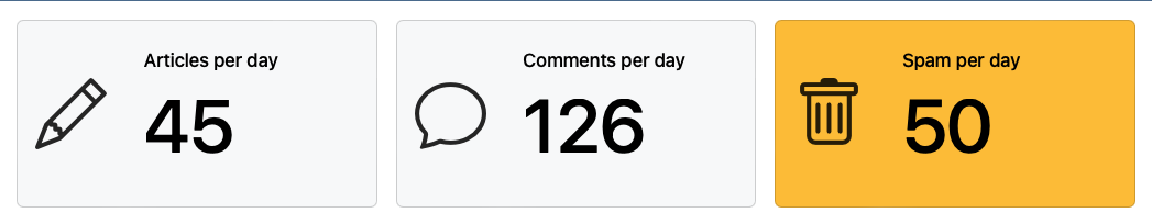
Shows key information
Digestible
Uses Icons
Icons
![]()
Common car warning lights
Do all make sense without a label?
With dashboards you can have hover-over labels or include text, but only while that icon still likely retains meaning
Icons lose & gain meaning much faster than you would expect

Started being used for romantic love in the 1400’s
Navigation

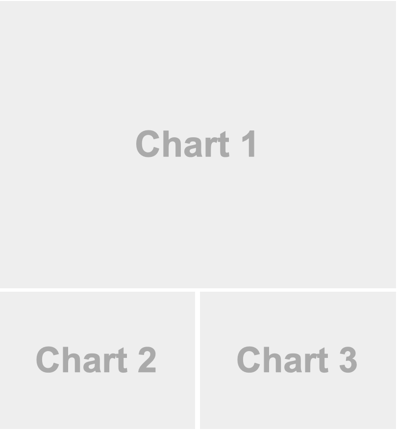
Layout
Orientation

Scrolling
Tabsets
Tabsets
Next time
![]()