Homework 4
For any exercise where you’re writing code, insert a code chunk and make sure to label the chunk. Use a short and informative label. For any exercise where you’re creating a plot, make sure to label all axes, legends, etc. and give it an informative title. For any exercise where you’re including a description and/or interpretation, use full sentences. Make a commit at least after finishing each exercise, or better yet, more frequently. Push your work regularly to GitHub. Once you’re done, inspect your GitHub repo to make sure it has all the components you want to submit in the hw-03.md file, including the prose, the code, and all plots.
Data sources:
BA_degrees.csv: https://wilkelab.org/SDS375/datasets/BA_degrees.csvcountry-pop.csv: https://data.worldbank.org/indicator/SP.POP.TOTL- Newspaper headlines: https://dataverse.harvard.edu/dataset.xhtml?persistentId=doi:10.7910/DVN/HSZ2QL
baltimore_sun_2019.csvcharlotte_observer_2019.csv
Question 1
Degrees over time.
For this exercise you will work with data on the proportions of Bachelor’s degrees awarded in the US between 1970 and 2015. The dataset you will use is in your data/ folder and it’s called BA_degrees.csv.
Load the dataset using
read_csv().Consider the Bachelor’s degrees awarded in 2015. If you wanted to visualize the relative proportion of these different degree areas, which plot would be most appropriate? A pie chart, a stacked bar plot, or side-by-side bars? Explain your reasoning and make the appropriate plot.
Now go back to the entire dataset BA_degrees but focus only on the degree field “Education”. Plot a time series (sing
geom_line()) of the proportion of degrees (perc) in this field over time. Also plot a straight line fit to the data. What do you observe?Create a time series (again using
geom_line()) of proportions of all degrees over time, highlighting by color only the ones that changed the most (you need to determine how to define “changed the most”) and using a gray color for all other fields. Each field should be represented with a separate line even though they’re all labeled “Other”. The fields that have “changed the most” should each be represented with a different color. Choose a reasonable color scale and a clean theme that avoids distracting visual elements. Explain your reasoning/justification for how you defined “changed the most”.Create the same time series again, however this time lumping togather the percentages of all “Other” fields so there is only one gray line indicating “Other”. (Hint: Use
forcats::fct_other()for the data wrangling.) Use the same color scale and theme as the previous plot.
Question 2
Country populations.
For this exercise you will work with data on country populations. The data come from The World Bank. The dataset you will use is in your data/ folder and it’s called country-pop.csv.
Load the two dataset using
read_csv().- You will need to use the
skipargument since the CSV file has some extraneous rows on top. First load the data without it, then determine how many rows to skip. - Make sure there are no extraneous columns by removing them.
- Use
janitor::clean_names()
- You will need to use the
Find the countries with the top 10 highest population count in 2020. Subset the data for just these 10 countries.
Create a bar chart showing the top 10 countries.
Question 3
Battle of the newspapers.
For this exercise you will work with data on headlines from The Charlotte Observer and The Baltimore Sun. The data come from the publication titled “A method for measuring investigative journalism in local newspapers” (Turkel et al., 2021). Specifically, I grabbed the data from for these two newpapers from the Harvard DataVerse here and filtered them for 2019 headlines for your use. The relevant files can be found in the data/ folder, and are titled charlotte_observer_2019.csv and baltimore_sun_2019.csv.
Load the two dataset using
read_csv().Omitting stop words, find the 20 most common words in headlines (
title) for the two newspapers. Save the resulting tibbles as two separate objects and print out the contents of the tibbles (including all 20 rows). Provide an interpretation for how the common words across the two newspaper headlines are similar or different in terms of focus.Using the tibble objects you saved in the previous step, create bar charts showing the top 20 most common words and their counts for each of the newspapers. Use different colors for the bars for the two newspapers (and stick to these colors for the remainder of this exercise). Place the two visualizations side-by-side using functionality from the patchwork package.
Go back to the original datasets you loaded in the first step, and row-bind them. Recreate the barplots (and their layout) based on this combined dataset, this time using faceting instead of patchwork.
Question 4
Brexit.
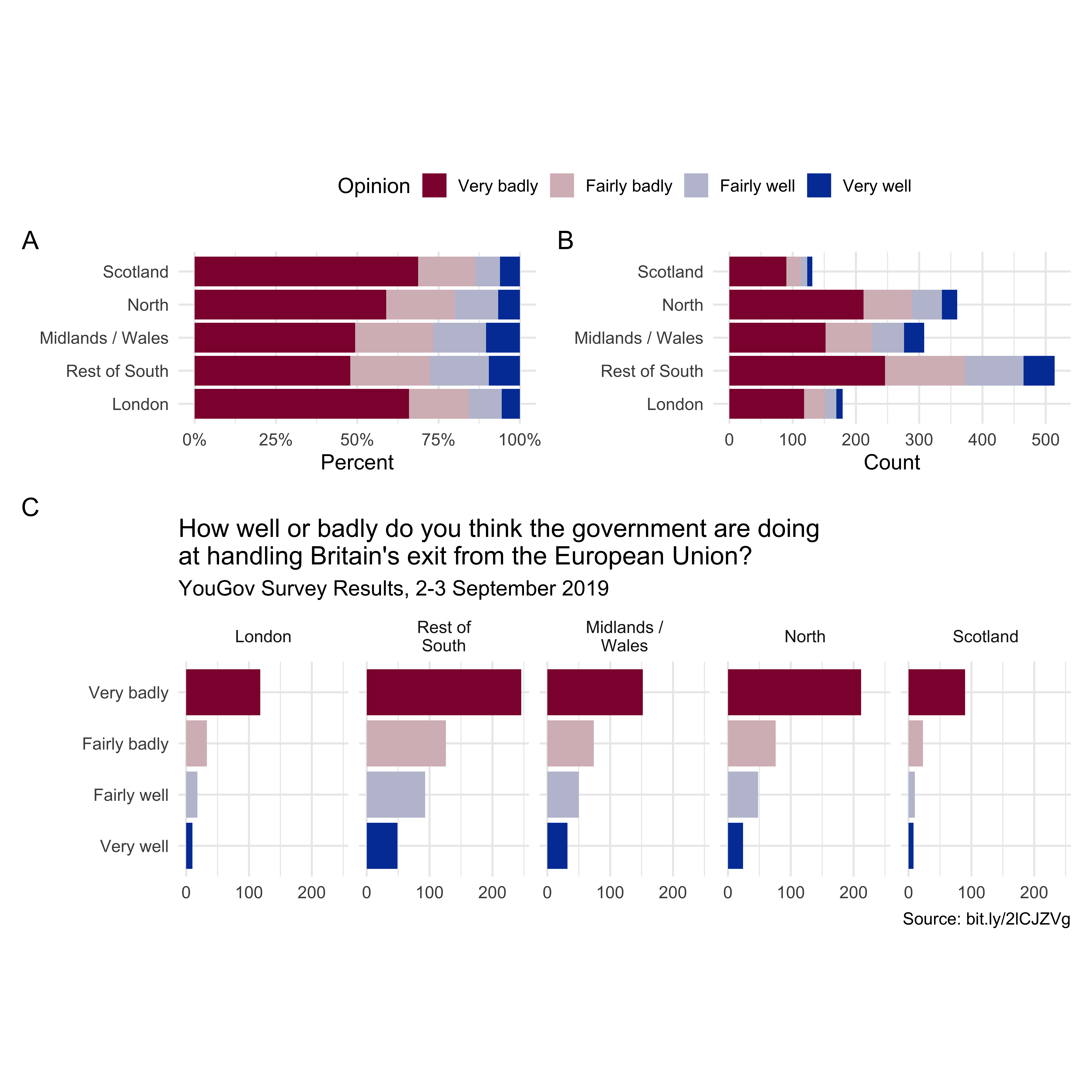
In September 2019, YouGov survey asked 1,639 Great Britain adults the following question:
How well or badly do you think the government are doing at handling Britain’s exit from the European Union?
- Very well
- Fairly well
- Fairly badly
- Very badly
- Don’t know
The dataset containing responses to this question can be found in the data/ folder and is called brexit.csv. Load the two dataset using read_csv() and create the following visualization. Your task is to recreate the following visualization, and to add a caption describing what each plot represents (Plots A, B, and C). Some hints to help you along the way:
- Before you get started, filter out the “Don’t know” responses.
- Use a diverging color scale from the colorspace package.
- Use patchwork along with its
plot_annotation()functionality to label plots. - “Collect” the legends (guides).
- For ease of copy-paste, the shortlink in the caption is
bit.ly/2lCJZVg.

